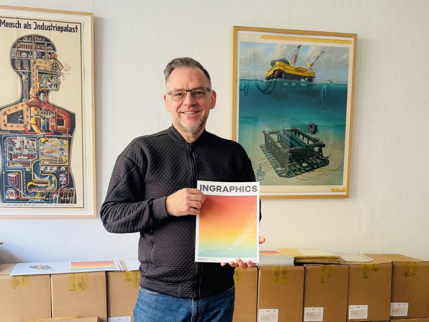
With nearly 35 years of experience as an infographic designer and journalist, Jan Schwochow—the driving force behind the relaunch of INGRAPHICS—speaks with TK Sajeev, Editorial Director of NewspaperDesign.org, about INGRAPHICS’ new beginning.
What is the core concept behind INGRAPHICS, and how does it differentiate itself from other design or data-journalism publications?
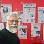
INGRAPHICS was published ten times between 2010 and 2017 by the Infographics Group and developed a small but very loyal audience. The issues were collected, and there was even a special collector’s slipcase. We know the magazine was not only read but also frequently used as a coffee-table book—especially in agencies and design studios—where it is still appreciated and collected today.What is new now is that I am working on the project on my own, without employees. In addition to my own work, I have invited outstanding colleagues from around the world to contribute. Guest contributions existed before, but now the entire magazine is in English and aimed primarily at people who enjoy gaining knowledge through visual storytelling. Most importantly, the content is not intended only for designers, but for a much broader audience—that is my main ambition.
What purpose do you hope the magazine will serve within the global infographic and data-visualization community?
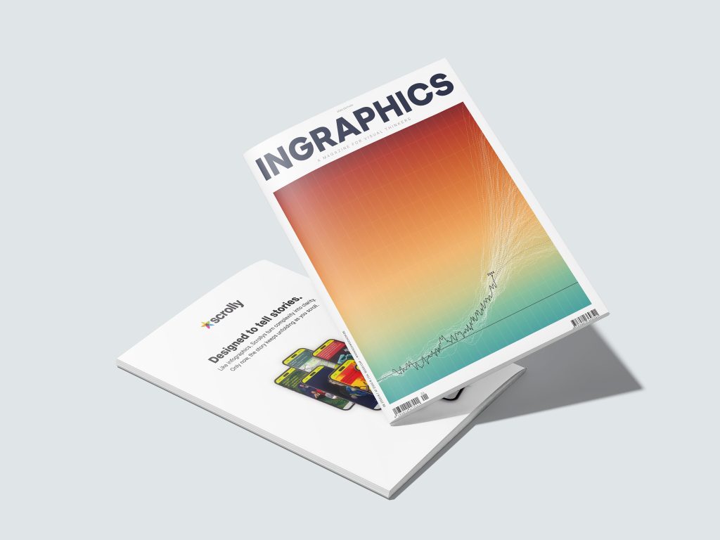
The original magazine already had a certain cult status, and I hope the new INGRAPHICS can build on that and continue the journey with many more issues. I am also considering expanding individual themed editions or even developing the brand further in a digital direction—through visual scrollytelling, for example. As the founder of the startup scrolly.com, this feels like a natural next step.
How did you define the editorial mission for INGRAPHICS, and in what ways does the magazine’s design reflect that mission?
Even though I did not know in advance what kind of graphics the many different contributors would submit, the result turned out to be exactly the kind of mix I had hoped for. Some graphics already existed and were mainly adapted typographically. I was also supported by the well-known German typographer Erik Spiekermann, who generously provided his excellent fonts.
At the same time, many graphics were created entirely from scratch, which is, of course, ideal. One defining characteristic of INGRAPHICS is that contributors are given complete freedom in both content and design. This was also true for the earlier issues. I want authors to explore ideas and creative approaches that are often impossible in their everyday editorial work. We all know how much of our daily output is shaped by compromise—because an editor dislikes one aspect and an art director another. INGRAPHICS is meant to be a space without those constraints.
Many magazines struggle to balance aesthetics with information. How does INGRAPHICS approach this balance as part of its conceptual framework?
This may sound slightly contradictory to what I just said, but it is one of the core challenges of our work. We want to inform people through graphics, but we also need to engage and entertain them so the experience does not become dry or boring. It is always a fine line.
We have a responsibility—and even a mission—to make people smarter. That means we cannot be creative for creativity’s sake. The graphics must be designed in the best possible way so readers can truly understand and process the information. This is something I want to keep very much in mind for future issues.
We come from a tradition of large-format poster graphics that are dense with information, and I would like to give more room to that approach again. If an author needs six pages for a topic, they should get them. I would also like to see more female contributors. I invited several women from the field, but unfortunately they did not have the time. I hope this will change in future issues, even though our profession is still very male-dominated.
Why was it important for INGRAPHICS to highlight contributions from designers and data journalists worldwide, and how does this support the magazine’s broader purpose?
There is, of course, also an economic aspect to this. Visual journalism has a large and very active global community that extends into data visualization, cartography, and science. Until now, there simply was no magazine that addressed all of us collectively.
Thanks to social media, awareness spreads quickly without large marketing budgets. Well-known contributors with strong followings naturally generate reach. For example, my first LinkedIn post about the new magazine quickly reached more than 12,500 impressions.
At the same time, I want to give lesser-known graphic designers and journalists a platform to increase their visibility. That makes the project exciting for everyone involved. And for readers, I guarantee a consistently high standard—both editorially and visually.
From the very beginning, what problem or gap in the design and storytelling landscape did INGRAPHICS aim to address?
My biggest frustration is the overwhelming amount of poor-quality and misleading data on the internet. While I hope the magazine appeals to colleagues, it is ultimately meant for everyone. The world is complex, and explaining that complexity is our job. We work with facts and scientifically sound data, and we take that responsibility seriously. The sheer volume of information today makes it difficult to see clearly—and AI will only intensify this problem. INGRAPHICS is my attempt to counter that. If you truly want to understand what is going on, you have to pay for high-quality work—work that can take weeks to produce for a single graphic—and you have to value it. INGRAPHICS aims to be a kind of beacon in the storm: offering orientation, clarity, and well-founded knowledge, rather than opinions or quickly produced noise.
How do you envision INGRAPHICS influencing readers—both design professionals and general audiences—regarding visual literacy and data-driven storytelling?
Infographics and data visualization have gained enormous importance since the turn of the millennium. I have been part of this field from the very beginning, even drawing graphics by hand before Macintosh computers entered editorial offices.
Today, readers are much more visually literate. They can read graphics fluently and construct narratives themselves from sequences of visual information, which reduces the need for long texts. Since projects like Snow Fall by The New York Times, this approach has also evolved into multimedia long-form journalism and scrollytelling.I find scrollytelling particularly interesting because it combines your personal speed with depth: you can absorb meaningful information within minutes, and it stays with you. Attention spans are a major issue today, and we must design accordingly. Often, less really is more—and for us, that primarily means focus.
In shaping the concept of the magazine, what guiding principles did you use to determine what belongs in INGRAPHICS and what does not?
I touched on this earlier. There are actually only a few core rules. Solid research, reliable data, and factual accuracy are non-negotiable. This transparency is visible to everyone in the appendix of the magazine. Ideally, the graphics should not be overly text-heavy. At the same time, I am open to more experimental visual formats, such as graphic-novel approaches—like the second section of the magazine, EIGHTY NINE SECONDS TO MIDNIGHT. Ultimately, INGRAPHICS should be enjoyable and engaging. If readers have fun and learn something at the same time, then the magazine has achieved its goal.
Of course, there are also moral and ethical boundaries, as in any serious medium in democracies.
.Can you share a bit about the design philosophy of the magazine ? What visual themes, typography decisions, or layout principles define the magazine’s identity?
So far, the design system is relatively restrained: a layout grid, a limited selection of typefaces, and a basic color palette. For the next issue, I want to refine this further and create more visual calm and consistency. Even in this issue, I paid close attention to minimum font sizes and correct color usage—there was already a lot of work involved there. My goal now is to develop solid templates that provide contributors with a safe framework while still leaving enough room for individual creativity.
What is your process for translating complex data into visuals that are both compelling and accessible to readers?
At the moment, there is no design team in the traditional sense—at least not yet. I produce the magazine almost entirely on my own, simply because hiring staff would not be economically feasible at this stage. However, I deliberately invited contributors whom I consider to be among the best in their field, so I never doubted their abilities. One person who played a crucial role in this project is my consulting editor, Kevin Cote. He proofread the graphics, questioned the authors, and challenged the content where necessary. Having someone with deep experience who can look at the work objectively is invaluable. Kevin is also a native English speaker, which is especially important since the entire magazine is published in English. That gave me a great deal of confidence in the final result.
![]()