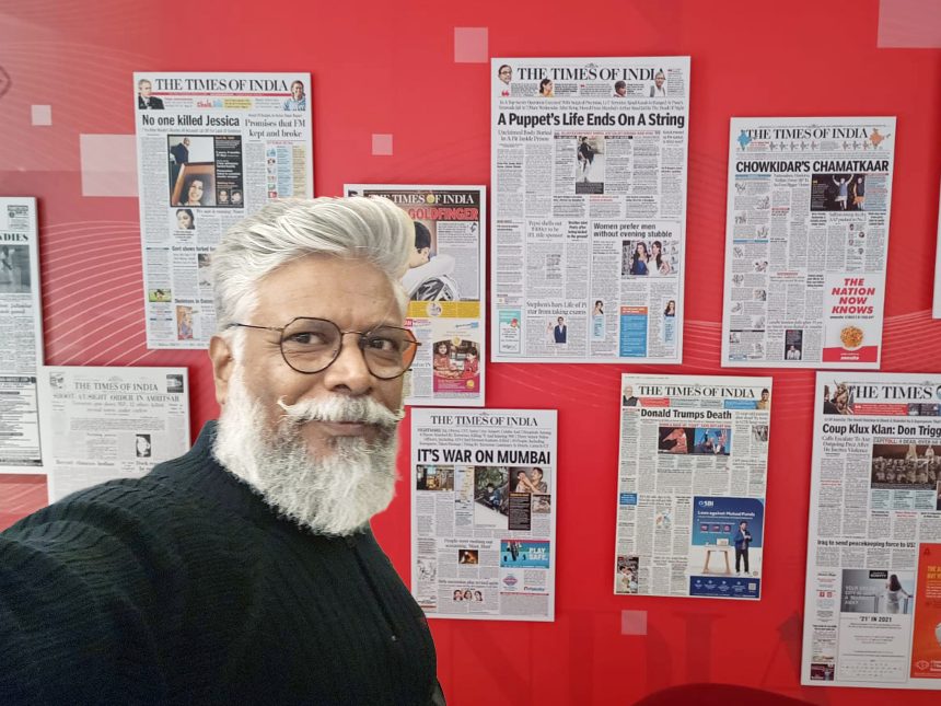
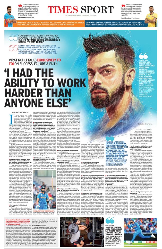
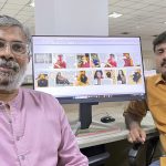
Shital Verma, National Design Editor of Navbharat Times—one of India’s most influential Hindi newspapers and a flagship publication of The Times Group—shares his journey and design philosophy in a conversation with TK Sajeev, Editorial Director of NewspaperDesign.org.
You’ve worked with major media houses like Dainik Bhaskar, DNA Mumbai, Hindustan Times, and Nav Bharat Times. How did each newsroom shape your understanding of editorial design?
I moved to Delhi after completing my postgraduate studies in Fine Arts at BHU, Varanasi, initially joining an advertising agency—a common path for many students at the time. However, that phase did not last long. I returned to Varanasi and, in 1995, moved to Allahabad to join a design studio run by the late Shantanu Mukherjee, who became my first mentor in publication design. Although I began my career as an illustrator, my passion for design was always strong.
In 2000, when Shantanu da and I relocated to Chandigarh to join the Dainik Bhaskar launch team, it proved to be a pivotal career move. At the time, I was somewhat apprehensive about the heavy use of clip art prevalent in design circles, so I consciously chose to shift toward graphic and page design, starting with feature pages.
At Dainik Bhaskar, I began working closely with reporters and editors. My sketching abilities proved invaluable, and I quickly developed the habit of sketching while listening to their story narratives. Working with esteemed editors such as Nidheesh Tyagi, Jaggi, Sanjoy Narayan, Ayaj Memon, Rahul Bhatia, Madhusudan Anand, Ramkripal Singh, and APS Khati exposed me to diverse approaches to storytelling. This experience helped shape my path in visual journalism and fundamentally influenced my career.
My time in the Hindustan Times (HT) newsroom was a profound learning experience, where I gained a deeper understanding of journalism and news presentation. My mentor, Anup Gupta, taught me numerous aspects of design—from initial scribbles to final checks. Long discussions during news meetings and close group deliberations before designing had a significant impact on my design philosophy. I also regularly discussed photo selection with the Head of the Photo Department, T. Narayan, and others, learning to evaluate images not only for their aesthetic appeal but also for their editorial value.
As someone who climbed from illustrator /designer to National Design Editor, what professional skills were most crucial to your growth?
When I began my career in news design, I had no knowledge of computers. I started learning on a Macintosh in 1996. At that time, designers were expected to be highly keyboard-friendly, and software expertise was considered a distinct advantage. Knowledge such as shortcut keys or advanced Photoshop techniques was closely guarded.
Driven by curiosity, I spent countless hours—often late at night—in the photo correction department learning and refining my Photoshop skills. I began designing with Aldus PageMaker, then moved on to QuarkXPress, and later to InDesign. Although I initially learned CorelDRAW, I switched entirely to Adobe Illustrator about 20 years ago and now rarely use Corel.
How do you balance creativity with the fast-paced deadlines of the news industry?
Although modern computer processors are getting faster, in my opinion the key to quick execution lies in experience and a sharp creative vision. This combination allows ideas to be translated into final designs very quickly.
What, in your view, defines powerful editorial design in today’s media landscape?
In my view, powerful editorial design today must be rooted in classic design principles while being executed with a contemporary approach. Many newspapers attempt to compete with electronic media by presenting news in a cluttered format. Unfortunately, this overlooks basic human psychology: in the morning, readers prefer a clutter-free, clean, and elegant presentation that is soothing to the eyes. Powerful design is one that respects the reader’s visual experience.
How do you approach transforming complex news stories into visually compelling layouts or info-graphics?
My approach is structured. First, I thoroughly understand the story and note all the important facts and figures. Then I create a few rough scribbles, followed by a clean drawing in the exact size and ratio. Finally, I select the most suitable designer for execution. If an illustration is required, I either handle it myself or guide the illustrator to achieve the best result.
Can you describe your method of brainstorming and finalizing page concepts for daily editions vs. special features?
For the daily edition: My method involves attending news meetings, closely monitoring developing stories, holding discussions with the desk and design teams, brainstorming creative inputs, and developing ideas for story presentation.
For feature pages: I get involved right from the beginning—contributing ideas, guiding execution, and coordinating images and illustrations. I strongly believe the newspaper’s look, especially the front page, should feel distinct all 365 days of the year. On days without a major breaking event, it becomes my crucial role to innovate, either through a powerful “Photo of the Day” or an out-of-the-box creative concept.
You’ve illustrated for lifestyle magazines, children’s books, ad campaigns, packaging, and storyboards. Which of these domains has most influenced your editorial work, and how?
During the 2009 recession, when I lost my job at DNA Mumbai, I spent about five to six months in Delhi before starting my role as Art Director at HT. During this period, I did extensive work creating advertisement storyboards. Storyboarding for advertising is a high-speed job, often requiring an illustrator to produce 15 to 20 frames in a single day. I would sit with creative directors as they narrated multiple versions of story ideas, camera angles, and shots (long shot, close-up, etc.). This need for quick rendering helped me immensely in handling newsroom challenges. I sometimes apply this technique by asking my illustrators to prepare a storyboard for a complex news story.
I also have a deep passion for feature page design. Designing feature pages for Gulf News allowed me to experiment extensively with picture treatments and typography.
How do you maintain consistency in your illustration style across different mediums and formats?
The traditional pen-and-ink medium remains my favourite, and cross-hatching portraits are my signature style. I also work in mixed media, specifically ink and watercolor painting. I began focusing on these techniques more seriously during the lockdown, when I was heavily involved in designing an app. The demanding 12–14-hour workdays were stressful, so I made time to sketch with a ballpoint or fine-tip pen. This soon became a habit, allowing me to publish portraits in the app.
What skills from traditional pencil drawing do you rely on most in your digital illustration work?
For me, digital tools are simply a means to create artwork; they are not used for photo manipulation or smudge portraits. The traditional pencil has essentially been replaced by the Apple Pencil on the iPad, which is an excellent tool, especially when I travel.
Your pencil eventually found ‘a new friend’ in the graphic tablet—how did this shift change your workflow and creative efficiency?
I started drawing with a graphic tablet about 25 years ago, but the technology was new in India, and my first tablet had an issue that couldn’t be resolved. I began using it again around 15 years ago to enhance my illustration skills alongside my design work. My abilities as an illustrator have complemented my design skills in many ways.
What digital tools or software have become essential in your daily professional work?
InDesign and Photoshop are my primary tools, with Adobe Illustrator as my third. For digital drawing, I have also learned Procreate.
How do you blend hand-drawn authenticity with digital finesse in your final designs?
I still create pencil sketches and pen drawings every day. I take a snapshot of the traditional sketch and share it with my team to complete the final design digitally.
Professionally, what motivated you to begin your series of celebrity portraits?
I used to draw famous cricketers in my rough notebooks when I was in school. It’s an old habit that dies hard
How do you research or prepare for creating a portrait of a well-known personality?
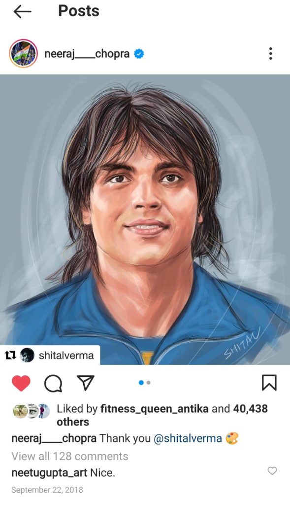
My process is simple: I create a portrait to mark either the person’s birthday or a significant achievement. For example, when Tokyo 2020 Olympic gold medallist in javelin throw Neeraj Chopra visited our office, I presented him with a portrait, which he was delighted to see and deeply appreciated. The portrait is still featured on his Instagram page.
What techniques do you use to ensure your portraits stand out in a world full of digital artwork?
Pen and Ink is my favourite and most popular style. This traditional approach stands out uniquely in the world of digital art and in the emerging age of AI-generated work.
Twice being featured in Creative Gaga’s “India’s Best Illustrators” issues—how has that visibility impacted your professional opportunities?
Being featured twice in Creative Gaga’s collector issues and interviewed as an illustrator did not significantly impact my professional opportunities in news design, but it brought me considerable recognition and visibility in the art world.
How did the approach from an Ex–Walt Disney senior artist influence your career trajectory?
When Dave Zaboski (former Walt Disney Senior Illustrator and Character Designer) saw my artwork in Creative Gaga, he was very impressed. He called me for a video chat, discussed my art, and expressed interest in future collaboration.
As National Design Editor, how do you mentor younger designers or illustrators in your team?
I’ve noticed that many designers today often lack a strong theoretical foundation and reading habit, unless they come from a formal design school background. To address this, I strive to explain concepts using clear logic and practical examples. The distinction between design and decoration—a lesson I learned from my mentor, Anup Gupta—is a core principle I pass on to younger designers. The fundamental purpose and principles of design must never be lost amid heavy workloads.
How do you encourage innovation while maintaining brand and editorial consistency?
This has been one of the most challenging situations I’ve faced in recent years. When encouraged to innovate, some designers tend to go overboard or overlook fundamental design principles. During collaboration with the editorial team, this can result in a loss of consistency and compromise the brand philosophy. At that point, I step in to provide a clearer and more effective direction.
What core design principles guide your work regardless of project type?
I follow the core principles of design—emphasis, balance, alignment, contrast, repetition, proportion, and white space—regardless of the type of project.
How do you stay creatively inspired while working in a profession that demands daily output?
I stay inspired through meditation, regular exercise, listening to classical music, and reading books. I avoid watching TV or OTT content except for sports and make it a point to watch documentaries and biographies.
How do you handle creative blocks or maintain quality under tight timelines?
I am not easily impatient. Importantly, I have built a highly capable team that has worked with me for the past 13 years, and they are well-equipped to handle high-pressure situations.
How do you see the future of editorial design evolving with AI tools entering the industry?
With the advent of AI tools, the future of editorial design in the newspaper industry is likely to shift from manual production to strategic, human-led creative oversight. AI will serve as a powerful co-pilot, fundamentally transforming the workflow, while the designer’s role evolves to focus more on strategy and curation.
Which emerging design trends are you personally enthusiastic about integrating into your work?
With the advent of AI, the design world has become increasingly cluttered and chaotic. As a result, minimalism and classic design are making a strong comeback. I am personally drawn to the minimalist trend and, as a Design Editor, favor a classic approach that incorporates ample white space. I recently applied this in one edition, resulting in a cleaner, more streamlined design.
![]()

Congratulations on a wonderful journey Shital 💐😍
“Shital Sir, you are truly a master of artwork. Your single creative line speaks a thousand words. Your dedication and exclusive style create a deep connection with readers. You truly deserve many more feathers in your shining cap.”