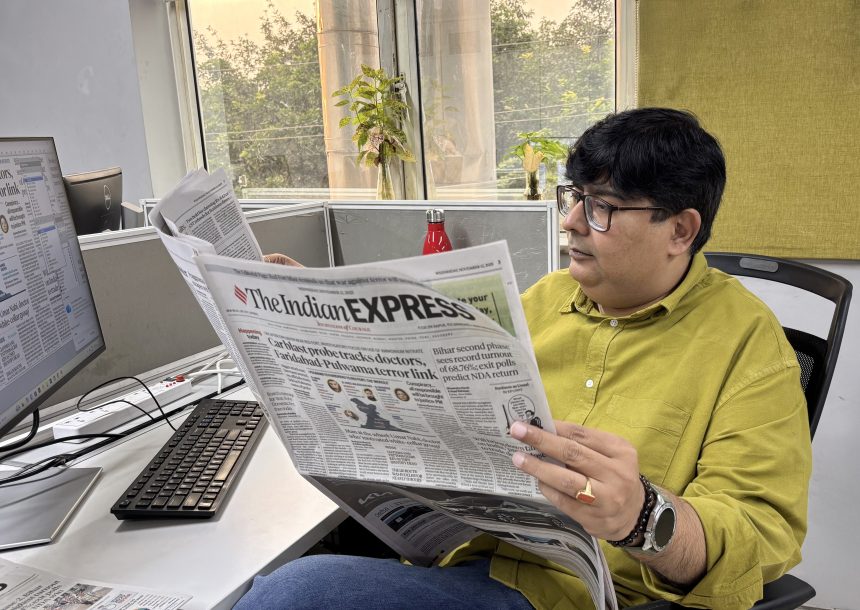
Nearly a decade after its last major revamp, The Indian Express has unveiled a striking new redesign. In this conversation, Mridul Mishra, Design Head of The Indian Express, talks to T. K. Sajeev, Editorial Director of newspaperdesign.org, about what drove the change and how the refreshed design brings clarity, coherence, and calm to the paper — reflecting the brand’s confidence and its enduring commitment to “Journalism of Courage.
What was the core motivation behind redesigning The Indian Express at this stage in its history?
The last major redesign was in 2014. In the past decade, the way readers consume news — in print and online — has changed a lot. Over time, many new elements and formats had been added, which made the visual system inconsistent. We felt it was the right time to clean up, simplify, and standardise the design so it reflects the clarity and confidence of the brand today.
How would you describe the new editorial identity of the paper — in tone, style, and purpose?
The new design mirrors the paper’s editorial identity — calm, clear, and deeply focused on substance. It creates space for nuance and reflection in an age of noise, staying true to The Indian Express tradition of rigorous, independent journalism.
What key principles guided this redesign?
Clarity, hierarchy, and simplicity were our guiding principles. Every decision was made to help readers move through stories easily and focus on what matters most — the journalism.
How do you balance the paper’s reputation for rigorous journalism with a design that feels more contemporary and accessible?
When I took over the redesign project from my predecessor in July, I received a clear brief from the editors: to create a modern and practical design that doesn’t chase trends. Instead of relying on visual gimmicks, I focused on a disciplined grid, thoughtful typography, and open layouts to bring seriousness and accessibility together. As A. G. Sulzberger once said, “The design supports the journalism; it never competes with it.” That idea guided my approach throughout the process.
Did the redesign aim to attract new audiences, or to strengthen engagement with existing readers — or both?
Both. We wanted the paper to feel more approachable for new readers while enhancing the experience for loyal ones. A cleaner structure, more visual rhythm, and stronger hierarchy make it easier for everyone to connect deeply with the content.
In what ways does the new design reflect The Indian Express motto, “Journalism of Courage”?
“Journalism of Courage” is about reporting the truth fearlessly and holding power to account. For me, it also means clarity and integrity. The new design expresses those values visually — confident but not loud, assertive but not aggressive. Its restraint reflects the courage to let facts and reporting speak for themselves.
How do you see the redesign influencing the kind of stories and voices that appear in the paper?
The new structure gives more room to long-form journalism, investigations, and explanatory storytelling. It helps balance depth and pace — allowing both quick updates and thoughtful analysis to sit comfortably together.
Could you describe the visual philosophy that guided this redesign?
It comes down to three words: clarity, calmness, and coherence. I removed clutter and built a clear hierarchy so the eye moves naturally across the page.
What inspired the use of more open layouts and white space compared to earlier editions?
We wanted to give readers room to pause and absorb. In a world full of visual noise, white space becomes a quiet luxury — it reflects the confidence of a brand that doesn’t need to fill every inch to make its presence felt.
How did you approach the choice of typography for headlines, body text, and subheads?
We used the Tiempos family from Klim Type Foundry for text and headlines, and Graphik Compact from Commercial Type for secondary elements like slugs and captions. These families were introduced during an earlier masthead refresh, so they were natural choices to carry forward. Tiempos brings clarity and elegance to editorial use, while Graphik Compact saves horizontal space without losing readability. Together, they give the paper a distinctive, modern voice that still feels rooted.
The new design uses larger photographs and bolder visuals. What kind of reader engagement were you hoping to achieve through this shift?
Images are now treated as part of storytelling, not decoration. Larger visuals draw readers into stories and add emotion and immediacy — it’s about engagement and comprehension, not spectacle.

How did you balance visual appeal with journalistic seriousness?
I used restraint as my design tool. The appeal comes from proportion, typography, and order — not flashy effects. The tone stays serious, but the reading experience feels more open and inviting.
What were the biggest challenges you faced while implementing a full redesign across all editions?
Implementing a full redesign across all editions meant aligning multiple workflows, systems, and teams. This time, it was more demanding because we were not only refreshing the design but also moving to new software and a new workflow system. Managing fonts, maintaining colour consistency, standardising stylesheets, and training across the newsroom were the toughest parts. It was only possible because of the tremendous hard work and dedication of my team members, along with the close collaboration between the design, production, and editorial teams.
Each section — Explained, The World, Economy, Sport, Express Investigation, and Big Picture — has a distinct visual identity. How were these conceptualised?
Each section reflects its own editorial rhythm. Explained focuses on clarity and diagrams; Express Investigation feels bold and confident; Big Picture is immersive and image-led. The idea was for every section to be instantly recognisable while still part of one cohesive system.
The Big Picture section stands out for its visual storytelling. How did you decide to allocate so much space to long-form visuals?
I believe strong journalism can also be visual. The Big Picture is designed to slow readers down — to make them spend time with a story and feel its depth. It celebrates photography and long-form narrative as an essential part of serious journalism.
How did you envision Express Investigation balancing depth and design clarity?
For Express Investigation, we used a pared-down palette and a clear typographic hierarchy so the reporting leads. The design is bold in its simplicity — serious, focused, and direct, matching the intent of the journalism.
Was there an intentional shift toward helping readers navigate content more intuitively?
Yes. Reader navigation was central to the redesign. I built consistent visual cues, clear section markers, and a strong headline hierarchy so readers can find what they value quickly — whether they read cover to cover or dip in selectively.
Beyond aesthetics, what strategic outcomes do you hope this redesign will achieve?
Beyond appearance, my goal is to make the paper feel lighter, more approachable, and more habit-forming. I want readers to stay longer, move easily between print and digital, and feel that The Indian Express matches their pace and curiosity.
How does this new design strengthen The Indian Express’s position in today’s media environment?
In a time when trust and attention are scarce, design becomes a signal of credibility. A clean, consistent visual language reinforces confidence in the brand and its identity as a serious, modern news organisation.
Do you see the redesign as part of a longer-term transformation — perhaps toward a more integrated multimedia newsroom?
Yes, absolutely. This redesign is a foundation for the future — one that connects print and digital. The modular structure and visual system are built to adapt easily to new formats and platforms as the newsroom evolves.
How do you plan to keep the design evolving without losing its core identity?
I’ve seen rigid systems ruin very well-designed newspapers, so my approach is flexible but disciplined. I’ve built a clear visual grammar — in grids, typography, and tone — that allows for evolution without losing identity. The aim is to keep refining, not reinventing.
![]()