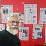
Gil Dicelli, Editor-in-Chief of the editorial design department at the Brazilian newspaper O Povo, speaks with TK Sajeev, Editorial Director at newspaperdesign.org, about creating bold and impactful covers.
An award-winning editorial designer and journalist, Dicelli has spent 26 years at O Povo, Ceará’s longest-running newspaper, leading its design team. His accolades include five ExxonMobil Journalism Awards, multiple Society for News Design Awards (including three in 2025), three European Newspaper Awards in 2016, and several ÑH/SND-E honors, including medals in 2019. In 2018, he redesigned O Povo for its 90th anniversary, earning international acclaim.
Can you share the story of how you began your career in editorial design and how you came to lead the design team at O POVO?
I became interested in editorial design while still in journalism school, through courses focused on visual communication, photography, semiotics, and everything related to visual literacy and the art of writing through images.
Which personal experiences or influences have most shaped your design philosophy ?
I believe my human experiences have shaped both who I am and all my work. From Brazilian culture and the place where I live to all artistic influences—music, theater, and other human expressions—I see every life experience as raw material for design.
How do you balance artistic freedom with the constraints of a daily newsroom schedule?
That comes with time and experience. It’s natural for someone starting out to feel anxious about this, but over time we become wiser at finding the balance between deadlines and creative freedom.
Can you walk us through your creative workflow—from receiving a story to finalizing the cover?
In a newsroom, there are many workflows. Typically, it goes like this: editorial meeting; assigning stories to members of my team; creative meeting with the entire design team, illustrators, and infographic artists; cover meeting and cover development with the editor-in-chief, photo editor, and cover editor. I usually present one proposal, and if it’s approved, I move to finalization. If not, I create a new proposal—or several—until the cover is approved.
How do you collaborate with editors and reporters to ensure design complements and elevates the narrative?
Very closely. Both my team and I have a strong relationship with editors and reporters, maintaining constant dialogue throughout the process to ensure we’re aligned.
Can you recall a moment when the initial editorial concept completely changed after you started designing?
Yes, it happens quite often. In a newspaper, change is natural—we’re working with a product that is dynamic and constantly evolving.
Several of your covers have won international awards from the Society for News Design. Which one holds the deepest personal meaning for you, and why?
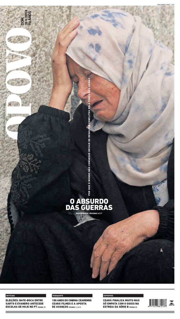
They are all important, but the cover THE ABSURD OF WARS touches me deeply—both as a journalist and as a human being.
The recent covers about Brazil–US tensions and Trump’s tariff decision are striking. How do you approach politically sensitive topics while maintaining visual impact? What was your guiding concept when designing them?
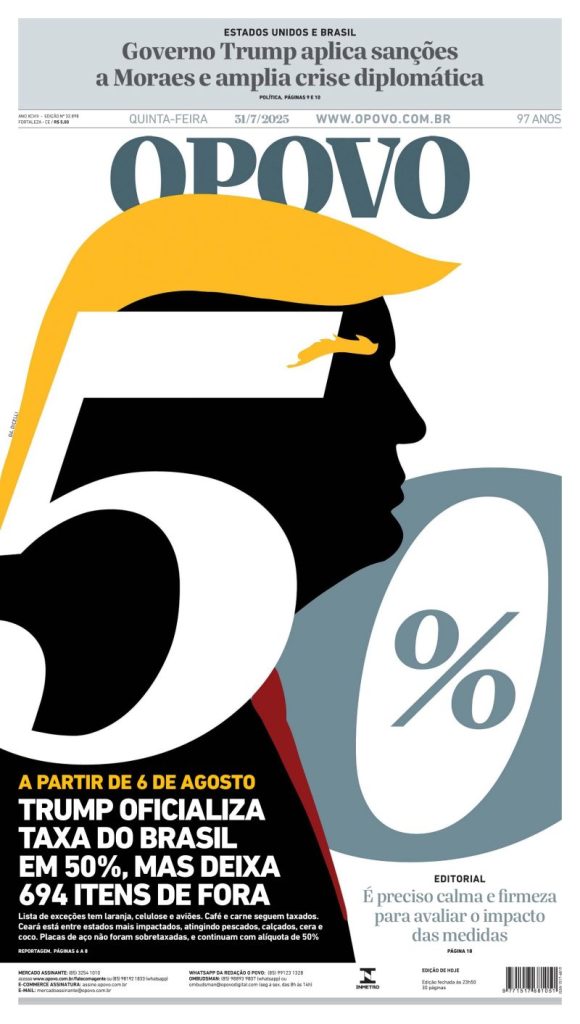
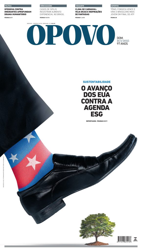
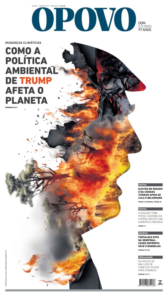
For me, the priority is always to follow journalistic ethics—in image use, colors, and typography—and to be as impartial as possible (which is always a challenge). The guiding concept was to create a poster-like cover, given the importance of the topic. Trump’s silhouette references coins, which often depict important figures in profile. Rendering him in black made perfect sense for the subject matter. The large, bold “tariff” blends with his profile, as they are intrinsically linked.
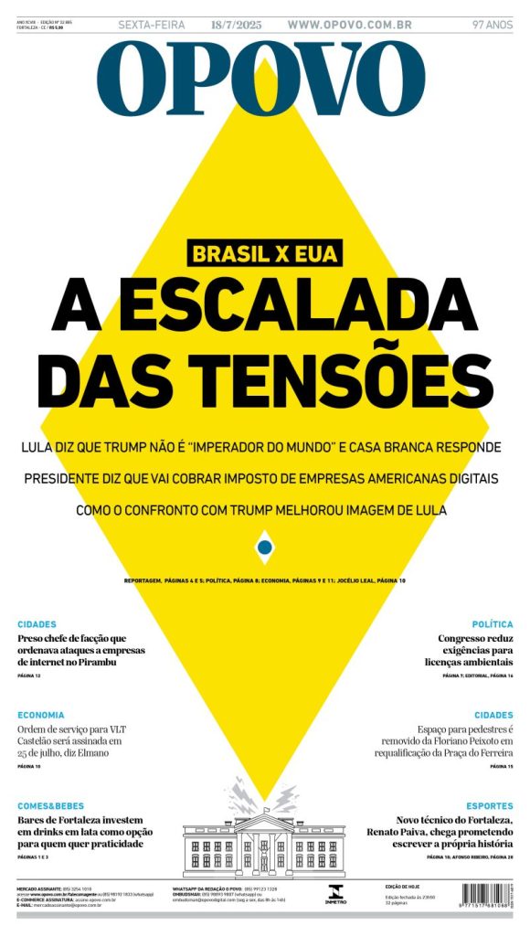
How did you decide on the symbolic use of shapes and colors—particularly the yellow diamond and the silhouette of Trump?
The yellow diamond is part of Brazil’s flag. The idea was to show that our sovereignty is greater than, and above, any external pressure.
How closely did you work with the editorial team to ensure these covers communicated both urgency and clarity?
We work very closely. No cover is approved without the input of a group of journalists. I may often come up with the concept and idea, but it will always go through my editors for approval.
How do you measure the success of a front page—reader feedback, peer recognition, or something else?
All of the above. But as a journalist, I see reader feedback as the ultimate measure of a successful piece of work.
How is the role of editorial design evolving in an age where readers consume most news on screens?
Editorial design is reinventing itself to create visual experiences that combine clarity, impact, and identity, maintaining relevance in both print and digital. On any platform, our work is more alive than ever.
In your opinion, what makes a print cover still relevant and powerful in the digital era?
Its ability to be relevant to the world and to people—to change realities and give voice to the voiceless. Whenever a cover can make a difference, whether for one person or thousands, it has fulfilled its mission.
How do you see the intersection of illustration, photography, and typography shaping the future of newspaper design?
These areas walk hand in hand. A designer must understand they are the conductor of the page, orchestrating all elements into harmony.
Have you ever faced pushback on a design due to its boldness or perceived political stance? How did you navigate that?
Not for political stance that I can recall, but yes for graphic boldness. It’s natural to understand our audience’s boundaries and respect how far we can go without harming the information. A journalist or designer who can’t work with frustration is in the wrong profession.
Where do you draw the line between provocative design and sensationalism?
I don’t work with sensationalism, so it’s hard for me to weigh in on that. Design should be effective, communicative, ethical, and creative. Everything else should be evaluated on a case-by-case basis.
How do you handle last-minute breaking news that disrupts a carefully planned cover design?
I love it. I’m a journalist at heart, and news is what drives me—it’s what drives a newsroom, what makes its heart beat, and the very reason it exists.
If you could redesign one iconic front page in history, which would it be and how would you approach it?
A cover that doesn’t yet exist: one announcing the end of wars worldwide. Perhaps an entirely white cover—white for peace.
![]()