By using this site, you agree to the Privacy Policy and Terms of Use.
Accept
News Paper Design
Tuesday, Dec 23, 2025
  • Home
  • About Us
  • Interview
  • Discussion
  • Competition
  • Infographics
  • Video
  • Sponsorship
  • Contact Us
News Paper DesignNews Paper DesignNews Paper Design
Font ResizerAa
Search
  • Home
  • About Us
  • Interview
  • Discussion
  • Infographics
  • Competition
  • Videos
  • Sponsorship
Infographics

The Most Impactful Infographics of 2025: How Leading Publications Are Redefining Visual

admin
Last updated: December 23, 2025 11:58 am
By admin Add a Comment
Share
SHARE

As Graphics Editor at The New York Times, Marco Hernandez highlights infographics that go beyond visual appeal to function as strong acts of journalism. The most impactful projects of 2025 show how design can clarify complexity, evoke empathy, and deepen understanding of urgent global issues. Across leading publications, these works use innovative formats, interaction, and thoughtful editing to transform dense information into clear, engaging narratives—demonstrating the growing power of visual storytelling to explain the world.

Reuters

Scammed into scamming

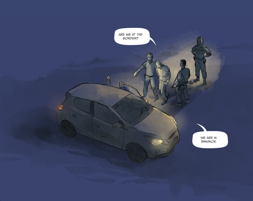
https://www.reuters.com/graphics/SOUTHEASTASIA-SCAMS/mypmxwdwwvr

The composition of this piece not only captivates the viewer’s attention but also employs an unconventional format reminiscent of a comic strip. The narrative is compelling, effectively eliciting empathy for the individuals ensnared in this perilous predicament. Beautiful work to tell the horrors of abduction and scamming in a powerful way.

The New York Times

Can you stop an outbreak of a contagious disease?


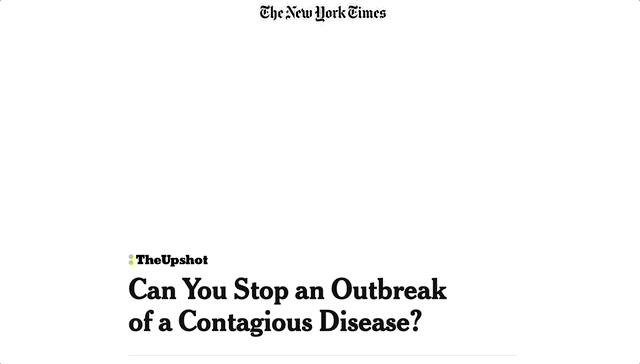
https://www.nytimes.com/interactive/2025/04/12/upshot/measles-herd-immunity-explainer.html
This piece successfully explains how quickly the dissemination of outbreaks can be under specific conditions. Unlike conventional explainers, it provides interactive simulations where you can edit the data and understand the effects in the outbreak, enabling a deeper comprehension of infectious diseases, vaccines, and related intricacies.

The Washington Post

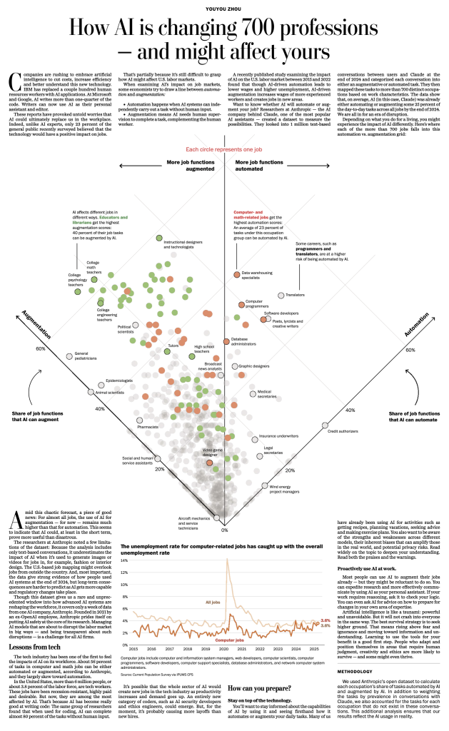
How AI is changing 700 professions -And maybe affecting yours


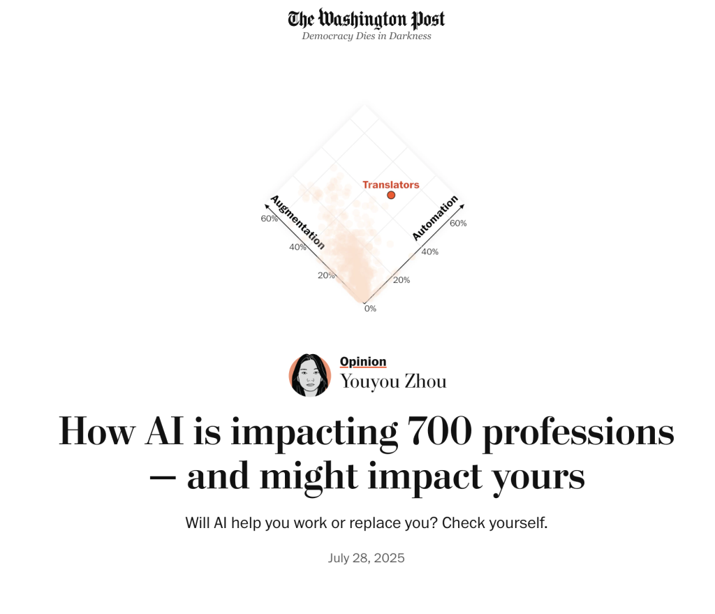
https://inconsolata.com/post/792955834494779392/oficiosia
The topic is spicy and trendy. There’s an interactive version of the piece to explore some of the data, but I think the print is a great solution, great design to focus on the big picture. I think paper can make us better editors because of the nature of having limited space and this is a great example. I don’t know how this was made, but I guess they did the online first and then edited the content for the paper, that’s the editing process working well.
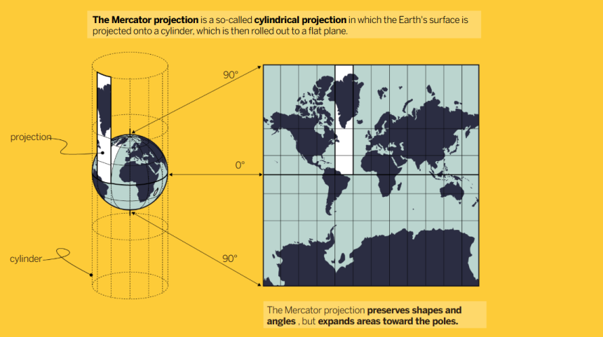
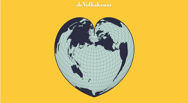
Volkskrant

One world, infinite projections


https://www.volkskrant.nl/kijkverder/v/2025/wereldkaart-mercator-afrika-projecties~v1707526/
This project is exquisitely designed; every map, animation, and illustration is simply brilliant. The piece explains the details behind the distortions and biases in cartography within the framework of the African Union’s demand and initiative to promote maps that better reflect scale and proportions.
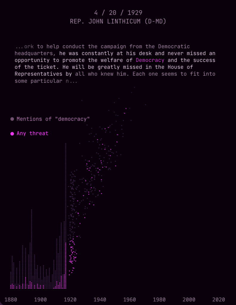
The Pudding

Threats to democracy in the Congressional Record


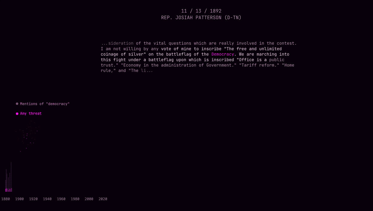
https://pudding.cool/2025/11/democracy/
This is a very efficient way to present data. It invites exploration of a dataset that would otherwise be too dense to present effectively.

Loading

TAGGED:infographicsMarco HernándezReutersthe new york timesThe PuddingThe Washington PostVolkskrant
Leave a comment Leave a comment

Leave a Reply Cancel reply

Your email address will not be published. Required fields are marked *

LATEST NEWS

Jan Schwochow on Reimagining INGRAPHICS: Visual Truth in a Noisy World
Infographics
Against the Clutter: Shital Verma’s Battle for Calm, Intelligent Newspaper Design
Interview
Designing for the Moment: Luke Knox on the Craft and Clarity Behind ESPN’s Visual Storytelling
Interview

Related Stories

Discussion

Designing Stories That Speak: The New York Times’ Marco Hernandez on AI, Visual Storytelling, and the Future of News Graphics

InfographicsInterview

Redefining Visual Journalism: Alexandre Calderón Speaks on Creativity, Data, and Trust

InfographicsInterview

Visualizing the Cost of Truth: How The National Told the Story of Journalists Killed in Gaza

Interview

Design with Integrity: Kannan Sundar on How The Hindu Shapes Reader Experience Through Visual Storytelling

Interview

Crafting Stories That Resonate: Marcelo Duhalde on SCMP’s Visual Journalism Success  

InfographicsInterview

Javier Zarracina on Crafting Award-Winning Graphics and Engaging Stories

InfographicsInterview

From Sketches to Global Stories: Adolfo Arranz’s Creative Journey in Design and Infographics

InfographicsInterview

Designing a Visual Journey from Athens 1896 to Paris 2024

Show More
News Paper Design

A prominent global platform for newspaper design, established in 2009 by T K Sajeev, operates as a non-profit entity with the mission of advancing and promoting the field of news design

Quick Links

  • Archive
  • Book
  • Budget
  • Colour
  • Comic Journalism
  • Competition
  • Design Course
  • Discussion
  • Redesign
  • Douglas Column
  • Illustration
  • Infographics
  • Interview
  • Job Alert
  • Kerala Flood
  • Magazine
  • Mobile
  • Page One
  • News
  • Photography
  • Technology
  • Titanic
  • Typography
  • Videos
  • World Cup Soccer

Contact us

Office Address
ENRA 24, Enjakkal, Aksharaveedi Lane,
Thiruvananthapuram , Kerala 695008
Call Information
Email:director@newspaperdesign.org

Connect with us

© 2007-2025, All Rights Reserved NewsPaperDesign.org Powered by Suffix E Solutions

Welcome Back!

Sign in to your account

Lost your password?