In a special session hosted by NewspaperDesign.org, The New York Times graphics editor Marco Hernandez engaged with visual and creative directors from around the world. More than 100 questions were submitted by 45 visual journalists, and the host curated the final set that guided the conversation.
From the expanding role of artificial intelligence in the newsroom to the enduring importance of clarity, relevance, and the “wow” factor in digital narratives, Marco shared insights shaped by years of creating award-winning visuals for global audiences. His reflections reveal how graphics can grab attention in an age of constant scrolling while staying truthful, human, and meaningful in a fast-changing media landscape.
Below is a curated selection of key questions and answers from this international dialogue on the craft and future of visual journalism.
Tomás Benítez (Senior Infographic specialist, Mexico):
How can artificial intelligence be integrated into the daily work of infographics, media, and other information-related fields? What opportunities does it open up, in which cases is it most useful, and how can we adapt to these tools that are transforming the way we create and communicate?
Marco:
Thanks for your question Tomás.
I think there are plenty of opportunities to add A.I. agents into the daily work while producing graphics, specially in work optimization. A.I. agents can help us to process batches of data sets, look for patterns, cleaning up and formatting data or assisting with code editing. All of that takes a lot of time.
The A.I. assistance is helping me solve problems easier and faster, but we always should have human supervision over those processes, checking afterwards. But it’s saving us a lot of time, that releases us to think about the stories and to create something more ambitious.
There’s a big thick red line in letting the A.I. do our jobs. But I can see a great benefit of letting some “monkey tasking” to the A.I.
Say I have a bunch of images or pdfs from a reliable source to create a graphic. I need that data tabulated into a csv file, but I don’t know how to code a script to achieve it.
In the old days, I’d probably need to find a developer or do it manually with a crate of coffee so I don’t fall asleep.
However, now, an A.I. agent like Copilot can guide me to create a python script that would get me that in minutes. That’s not replacing the developer or the designer, it’s liberating time so I can focus on the most important task to understand the story and create the visualization.
Same as before, I do that process manually I might make some mistakes, even with the massive coffee mug to keep you awake, you have to check the data after right? Well same for A.I. assistants helping you, you can’t trust blindly all, you need human supervision and control.
Manuel George (Visual Editor, Malayala Manorama, India) :
Should infographics aim first to simplify and clarify, or to impress with visual impact — and where do you draw that balance as a journalist?
Marco:
Thanks for your questions Manuel.
I think we need to understand the story first. I don’t really like to say “simplify” sometimes the detail is good too. I’ll say we all need to find the intention of the piece, that message that my piece will deliver to the readers.
Then I can start thinking about the elements I need in my piece, what’s crucial to understand this, what’s complementary information and what’s not relevant. All of that hierarchy and sorting would help to guide your efforts to make the information impactful in the way the story needs.
The comprehension is above the impact. An impactful visual with no deep meaning is weak… unless you are decorating a story. But if you are trying to do impactful graphics, the message itself has to be clear, the style must serve as a tool to promote that message.
You’ve created some of the world’s most impactful visuals. Which project stayed with you emotionally long after it was published, and how did you carry that responsibility?
Marco:
Thanks, that’s a big statement, but I appreciate it.
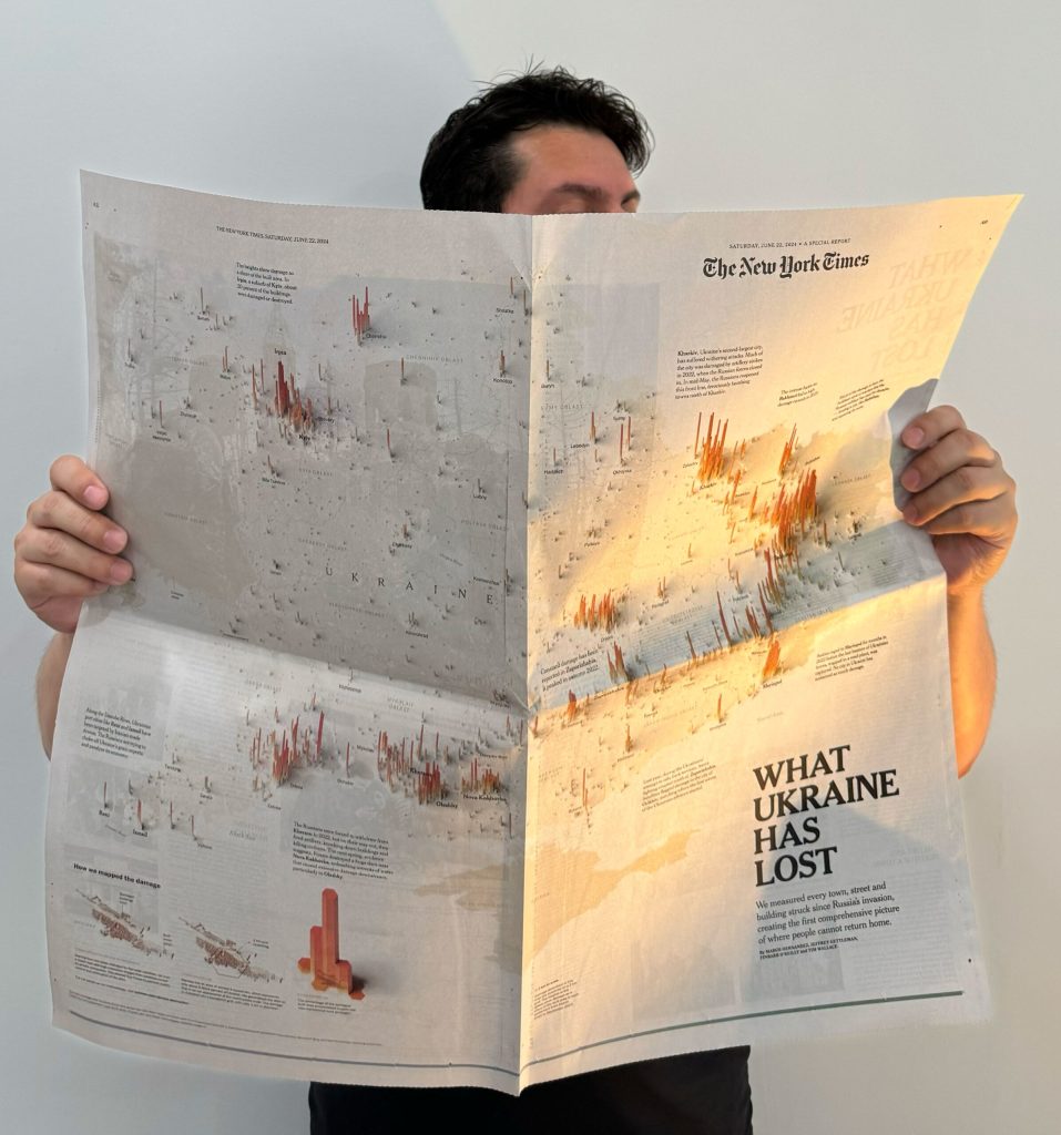
There are many stories with a deep meaning to me for different reasons. Maybe because the story was difficult to execute like the damage assessment of Ukraine I published with the Times in 2024. That same year, the illustrated scenes from the RNC and the DNC because of the format and execution, were fun stories to do. Drowning in Plastic with Reuters stayed with me for a long time, sometimes coming back because it was visually powerful but also spawned a change in the way or doing things for me. And so many more like that all for different reasons. Even the ones that did not went well, I have a collection of failures in my blog, I really appreciate the lessons learned from my #infofails.

Mathew Kurian (Creative Director & Former Senior Designer, The National):
What’s the most effective way to design visuals that instantly capture attention online?
Marco:
Thanks for your questions Mathew.
That’s an excellent question. We’re competing fiercely for people’s attention more than ever. We’re overstimulated across many channels and have little time to dedicate to each thing, regardless of whether your story is good or not.
If you are doing a video piece, a short one where you can understand what’s about and why I should care within seconds. Then of course when you get them, you can go deeper into details and complementary info.
If your piece is a long read, give me a summary, a punchy headline and get me the relevant stuff in one sentence, pair that with a powerful visual and you got me there, I’ll read more if that’s interesting.
I think we fall in love with details, small bites first is way better to catch the attention of readers.
Considering that most of the readers would not spend more than 2-3 minutes in your piece, why would you want to do a whole book?
In your experience, how can infographics balance clarity and visual impact to engage digital audiences?
Marco:
Clarity is good, I’ll say along the same lines of the efficiency to catch the attention of readers, the trick is in complementing information. Good summaries, smart headlines, clear a message and a visual that complements all of this. That’s a powerful recipe.
It’s not enough to impress readers with striking images and expect them to stay for that alone.
If you have a few more elements in harmony, the experience will be enhanced. I believe the key is to treat the other elements of the story you’re creating with the same care as your impactful visual. They are also part of the story and make the difference in whether the reader wants to continue reading or not.
What key elements make a piece of visual storytelling stand out in today’s fast-scrolling online world?
Marco:
Isn’t new or exclusive to the digital world, but the effect “wow” is really important. If your piece evoques that to your readers your piece stands out by itself.
When the piece reveals something unexpected and interesting I can say that’s a memorable story.
It’s very hard to achieve actually, you have a small window to cause that effect quickly, high up in the page, and the longer the story gets the harder to maintain it’s.
Then there are those pieces that are a pleasure to visit; they won’t necessarily leave you speechless, but the craftsmanship and attention to detail are exquisite. You’ll want to stay and see everything. That’s another branch of the tree of memorable stories.
So far we have the “wow effect”, the attention to details, and maybe we can add to the list the relevance in the news to me. No matter how beautiful a piece is, or if it reveals something unique, if the focus is not relevant to me, I don’t care about all of that.
Find a way to make the experience personal, appeal to a group of readers and show them why it’s important and how they would be or are affected.
If you have “wow effect”, attention to details and relevance… you have a graphics silver bullet.

Kannan Sundar (National Design Head, The Hindu ) :
How do you strike the balance between making a graphic visually stunning and ensuring it remains journalistically accurate and accessible?
Marco:
Thanks for your questions Kannan.
I think those two things are not divorced from each other. First I have to think about the message that my piece will deliver, what elements should have, what’s relevant and what’s not. What information I need to get the main point, maybe what’s nice to see but not crucial.
Then, we use the design to enhance those priorities. In the process we find that color, size, space and composition would help me to enforce the message, push and pop-up the crucial information and make quieter what’s not key but provides nice context. After some iteration, that piece will be balanced, will be beautiful.
If it’s visually impressive, but is not talking to the story, or isn’t clear in priorities, it will lose appeal, the more you read it, the uglier it gets.
Since you’ve worked on stories that reach international readers, how do you design visuals that cut across cultural and language barriers?
Marco:
That’s a great question, I love it.
It’s really a challenge, I remember when I was at Reuters, my pieces often required an adaptation for Japanese, Arabic, Chinese or Cyrillic. The only way to achieve something efficient was to do it closely with a native of that language. Your own biases and nearsighted perspective can lead you into foolish mistakes. Even between the same language, words don’t really mean the same always. I speak Spanish with my Costa Rican twist, many words do not make sense for Spanish speakers in Spain or South America.
You have to be involved in the process, take all those questions and feedback on you, and never go alone with google translate or chat GPT. Beyond words, colors, space and layout might have different meanings, so only working closely with someone who understands those caveats can truly be converted for a different culture.
What combination of tools (design, coding, data cleaning) do you rely on most today—and what skills should young designers focus on to stay relevant?
Marco:
Tools for me aren’t super significant, there are many ways of doing the same with a different tool. I use a lot QGIS and Adobe stuff, but many people can do the same QGIS does using ARCGIS, maybe replace Adobe illustrator with Inkscape or Figma.
My daily work includes Visual Studio Code, QGIS, Adobe stuff (ai, psd, ae…), and Blender or C4D.
For young professionals I’ll recommend finding first your area of interest, then, polish the basics to cover that area, let’s say cartography, so you will need adobe, mapshaper, maybe python, QGIS and some svelte.
Graphics for video might require a different set of skills, blender is always a good idea.
The only way to stay relevant is to be curious all the time, try new stuff, experimenting with new ways of doing things in your area of expertise. But that doesn’t mean to become a master in everything but rather a person who understands the basics of disciplines, someone able to use things creatively. That’s someone relevant I’ll say.
Where do you see the future of news graphics—more towards interactivity and AI-driven design, or a return to simpler, print-like clarity?
Marco:
There’s value in print, I think doing graphics for print is a great editing exercise, if you want to be better at editing your own stuff, try creating a piece for the print from time to time.
Now, video for me is a promising horizon. There are many opportunities there.
A.I. isn’t a field to dedicate yourself, A.I. agents are just tools for all of us. I’ll hate to see a creator with a degree in A.I. prompting and zero knowledge of basic principles of visual story telling. The A.I. will drive the pieces then and that’s not right.
As someone working in the Indian newspaper industry, I admire your ability to merge data, design, and storytelling. What advice would you give to designers like us who are trying to push visual journalism in traditional newsrooms?
Marco:
I think we need to create the space to show what a visual story teller can do with the support of the newsroom.
Try little experiments where you can show how things can be told visually.
Find allies, there are always colleagues in the newsroom with an appetite to be creative.
Finally go crazy with doodles, they are super effective at explaining basic ideas beyond words. That’s for launching a project and iterating quickly through ideas. In other words, when people use their imagination to fill in the gaps of abstraction, they begin to build bridges to create more visual stories. It’s a simple strategy, but it works.

Ahamed Zubair Paramban (Chief Sub-Editor, Malayala Manorama, India) :
In India, readers are still very text-focused. Many times, we end up explaining a graphic with text instead of letting the graphic explain the data. From your experience, how can we design visuals that stand on their own and still engage such audiences?
Marco:
I think it’s a process, it’s hard to change habits, but short small texts that complement visuals are a good way. Point at things in your visuals with a little text, guide your reader to look at a particular highlight and add little notes if possible.
One other trick is to link the visuals and text with design elements.
Suppose you want to describe a procedure on the Moon; imagine you have a picture of a crater with labels on it such as “perpetual darkness” and other things such as “rare rocks“, “dust“, etc.
Now the accompanying text can refer to the image, such as “In the image above, the areas of perpetual darkness have x-characteristics… rare rocks interact with the environment in x-way…”
Match those highlights of the words “perpetual darkness” in the text and image in the same color. You can use 1 or 2 times that trick, maybe the rare rocks can be highlighted in yellow in both text and image.
Your reader will notice and will reread the text and image a couple of times, even unconsciously. This habit will show you a way to link images more efficiently; it’s a small trick, but it works well. Over time they look for associations and codes in your pieces.
Use both elements, visual and text, as complements.
If you are working on an online piece, make sure there’s enough space to read comfortably before the image comes in or changes, readers can pay attention to one thing at the time. If you are working in the print, make sure you have established hierarchy.
India has rich visual traditions—folk symbols, temple art, and local patterns. Do you think these can be meaningfully blended with modern information design?
Marco:
Absolutely, our culture permeates everything we do, and it’s good to integrate that if your audience is localized.
However, if your audience is wider and mixed, you have to be careful not to be too specific because you can easily lose readers just because they aren’t familiar with your cultural winks.
The balancing point is perhaps whether including those things helps to deliver the message more efficiently, or whether it can evoke a thought more efficiently. Even if it’s negative to both of those things, giving the pieces a bit of identity isn’t a bad thing, as long as it doesn’t disrupt the message and is appropriate for that interpretation.
As news increasingly shifts to digital and social platforms, what opportunities do you see for innovation in interactive graphics—and what pitfalls should we be careful about?
Marco:
Interactivity is a very wide term. If we are talking about the essence of visual interaction, I think there’s a lot of potential to expand graphics into video, we have very little production in that field because the production demands a lot of time and resources but it’s becoming easier I think.
If the term interactivity is meant to include buttons, actions from readers and such things, I think specialized, like scientists or researchers might use exploration tools, but if that is not the case, average readers would not engage like that. We should reduce the presence of buttons, sliders and other things requiring “extra work” from our readers.
I think innovation can be defined as a way of showing a story using something in an unconventional way, but not necessarily a complex interactive development.
If public data is often messy and inconsistent. How do you approach turning imperfect datasets into visuals that remain both clear and truthful?
Marco:
That’s a big problem indeed. It is tricky, I guess it depends on the case.
One thing I might do is to say in our piece “according to partial data reported by x-public-source”. We can’t fill in the gaps there to make the graphic nice, but we can bring other experts to tell us something about that missing data for example. We can add a projection or an annotation to the missing data based on the experts views and feedback. It would be something like “according to x-expert, missing data from this public source might show that xyz…”
One other way of doing that if the expert approach is messy or not feasible, is to reduce the scoop, try a new focus to the story, show me a little bit of that data to make a point. Then you can complement the story with other bits providing evidence that this is a thing I should care about, even though it’s incomplete. That would be a great story I think.
In many print newsrooms, graphics are still seen as taking up space rather than adding value. But in today’s visually vibrant social media environment, do you think this mindset needs to change—and how can we show that graphics actually strengthen storytelling in print?
Marco:
Print “real-estate” is precious, I think a graphic should use only what it needs to communicate the idea. I think vibrant social media trends are dangerous for visual journalists, newspapers should not compete against social media because those are different worlds. Said that, the graphic can be elegant, functional and impactful… using only the necessary space.
There’s a teenager phase we all infographic-designers go through, the practice of “inflating” the graphic to make it beautiful and to stand out. However, if you don’t have enough information it would be a disaster, my reader would notice it and simply will go quickly over it, next time maybe even skip the graphics because they are taking too much of your page for nothing.
If you have enough data, or a good justification to go gigantic, sure why not!
But often that isn’t the case. I like analogies, think about this like when we do a digital illustration. You might want to do it twice the size it would be displayed, so when you place it in the final location it would gain detail. In other words, make it smaller to gain detail. If you go the other way around, your precious illustrations would look badly pixelated. Why would you want to give readers content that isn’t suitable for that size?
![]()