Alexandre Calderón, Graphic Editor at El Financiero, Mexico, speaks with TK Sajeev Kumar, Editorial Director of NewspaperDesign.org, about the creative process behind developing infographics and data visualizations.
How do you define the role of a graphic editor in a modern newsroom like El Financiero?
For me, the role of a graphic editor goes far beyond simply “decorating” a story. I see my work as building an emotional and intellectual bridge with today’s reader—someone more demanding and fragmented than ever before. My goal is to deliver information that is clear, credible, and visually engaging, so that graphics don’t just accompany the story, but enhance and elevate its editorial message.
At El Financiero, under the leadership and trust of our Editorial Director, we operate in a horizontal, self-managed model—very different from traditional hierarchical structures. Each designer and infographic journalist takes full ownership of their visual proposals, supported by the newspaper’s editorial standards. This structure requires sound judgment, strong training, and professional autonomy, but it also gives us the freedom to innovate and develop a visual maturity that has become strategically essential.
For me, graphic design doesn’t merely reinforce the editorial narrative—it amplifies it. And in doing so, it strengthens the trust we build with our audience.
What inspired you to focus on infographics and visual storytelling?
When I was young, I took a few psychology classes and discovered a world that changed the way I saw communication. Cognitive psychology helped me understand how the brain perceives, processes, and communicates information, while Gestalt psychology revealed how visual patterns shape clarity and impact.
Later, my training as a visual artist gave me a foundation in drawing, composition, and color. It taught me to see art not just as self-expression but as a set of tools that can be applied to design and editorial storytelling. That shift—from art as personal expression to design as purposeful communication—was a natural evolution.
Once I entered the professional field, I explored the potential of infographics as the perfect medium to deliver messages clearly and meaningfully. I’ve drawn inspiration from global masters like Adolfo Arranz (Reuters), Marcelo Duhalde (SPH ), and Marco Hernández (The New York Times); Fernando Baptista and Mónica Serrano from National Geographic; and my Mexican colleague Diana Estefanía Rubio, whose work reminded me that visual journalism should move people as much as it informs them.
This journey led me to see editorial designers not as decorators, but as true content creators—professionals who research, refine, and construct narratives as part of an integrated editorial process. That’s the vision I bring to every project.
How do you decide when a story needs an infographic rather than a traditional article?
It begins with understanding the nature of the information—and how readers can best grasp it. When data is complex, numerical, or requires showing spatial, temporal, or hierarchical relationships, an infographic is the ideal tool. It translates abstraction into clarity.
But when a story demands deeper interpretation or narrative nuance, text becomes irreplaceable. The challenge is not to choose between “image or word,” but to combine them effectively. Sometimes visualization reinforces the written word; other times, the infographic alone captures the essence more powerfully.
Ultimately, the key question is: What does the reader need to understand this story clearly and meaningfully? That question guides every editorial decision—and often leads to a balance between words and visuals working in conversation.
Could you walk us through a recent infographic project, from idea to publication?
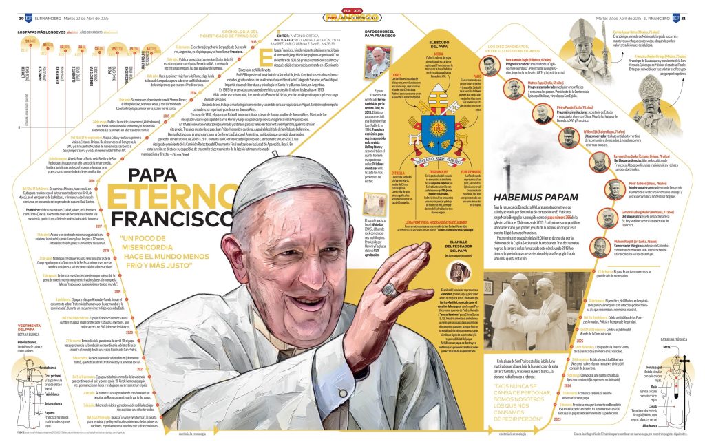
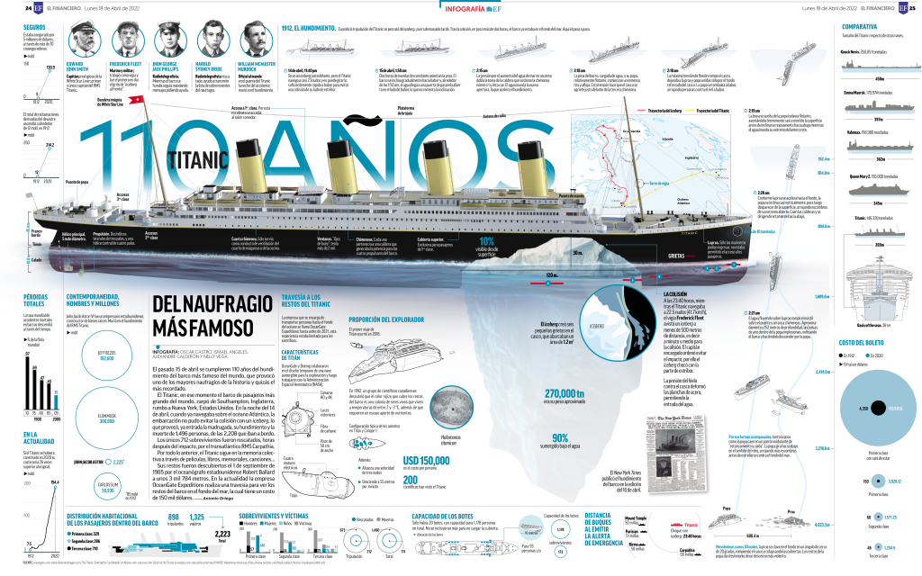
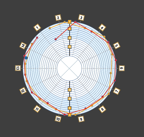
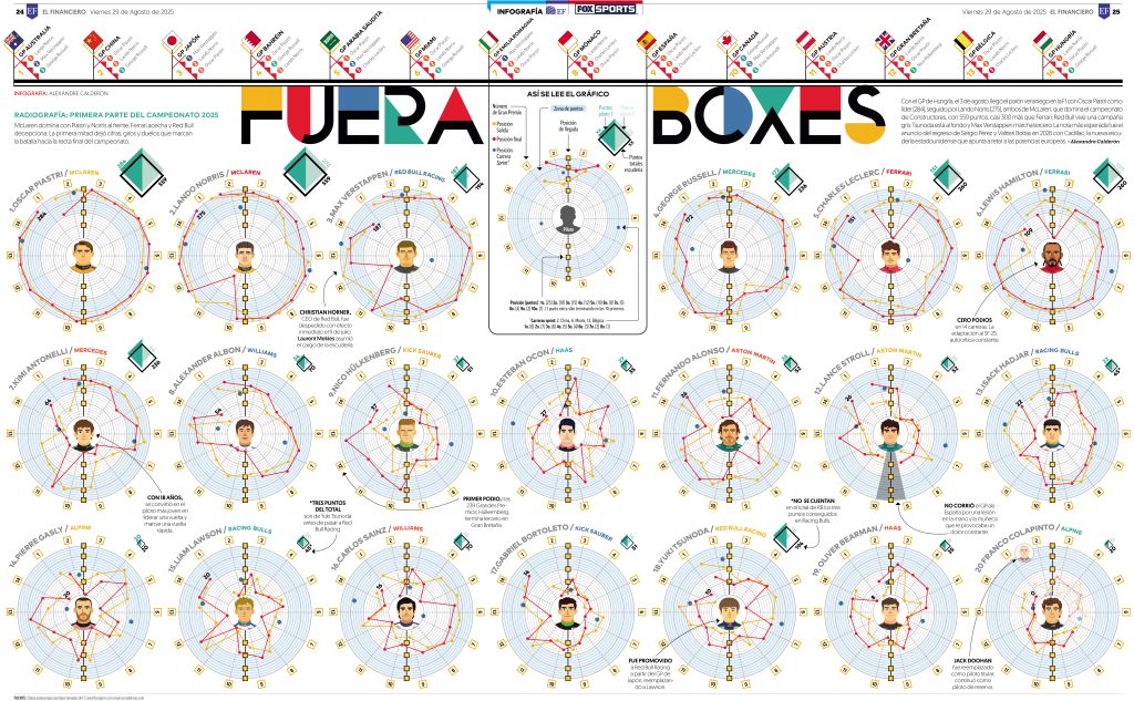
One of my passions is motorsport—particularly Formula 1. At El Financiero, I’ve explored ways to bring readers closer to this world through data-driven storytelling. A recent example was a three-page infographic showing the state of the championship at mid-season.
Step 1: Defining the Editorial Goal
I began by framing the core questions: How are drivers performing after the summer break? What context does the reader need? From there, I outlined the key data—rankings, circuits, podiums, poles, and retirements—verified directly from official F1 sources.
Step 2: Data Collection and Structuring
I normalized and cleaned the data, ensuring accuracy and consistency. This stage isn’t just technical—it’s narrative. Numbers become meaningful only when they tell a story.
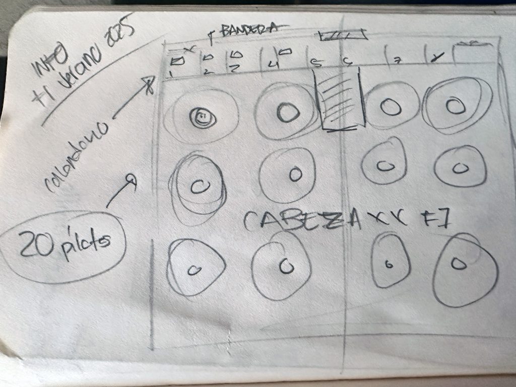
Step 3: Visual Construction
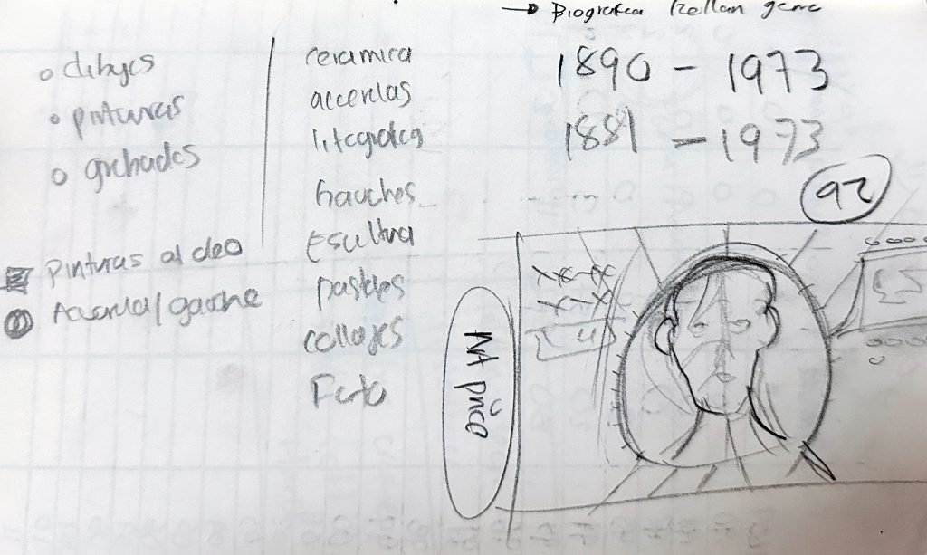
Through initial pencil sketches, I outlined the architecture of the infographic by first establishing the narrative construction, articulating the communicative intention and the focus of the visual storyline and subsequently systematizing the content through the 5W+1H model (What, Who, When, Where, Why, and How). Within my methodological framework, this model operates as an operational scaffold that translates narrative intent into a clear and strategic informational structure. This stage enabled the definition of hierarchy and visual flow prior to transitioning into digital tools.
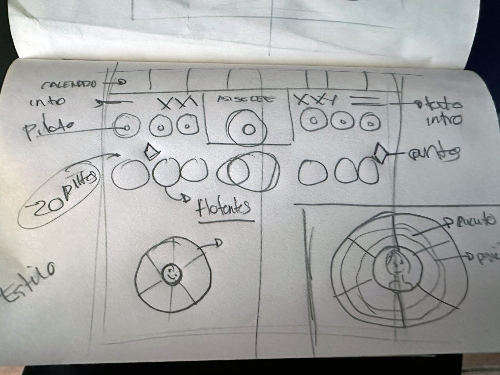
Step 4: Digital Execution
I transferred the layout into Illustrator and Procreate, designing circuit charts and radar graphs to illustrate driver performance. Each visual element served a purpose: to clarify patterns, not decorate the page.
Finally, I collaborated with the editor for final stylistic and editorial refinement, while preserving the narrative structure that had already been established during the research phase.
How do you source and validate your data?
I always begin with a clear thematic focus, then collect and cross-check information from reliable sources. My process involves both primary sources—official databases, institutional reports—and secondary ones such as reputable analyses or media coverage.
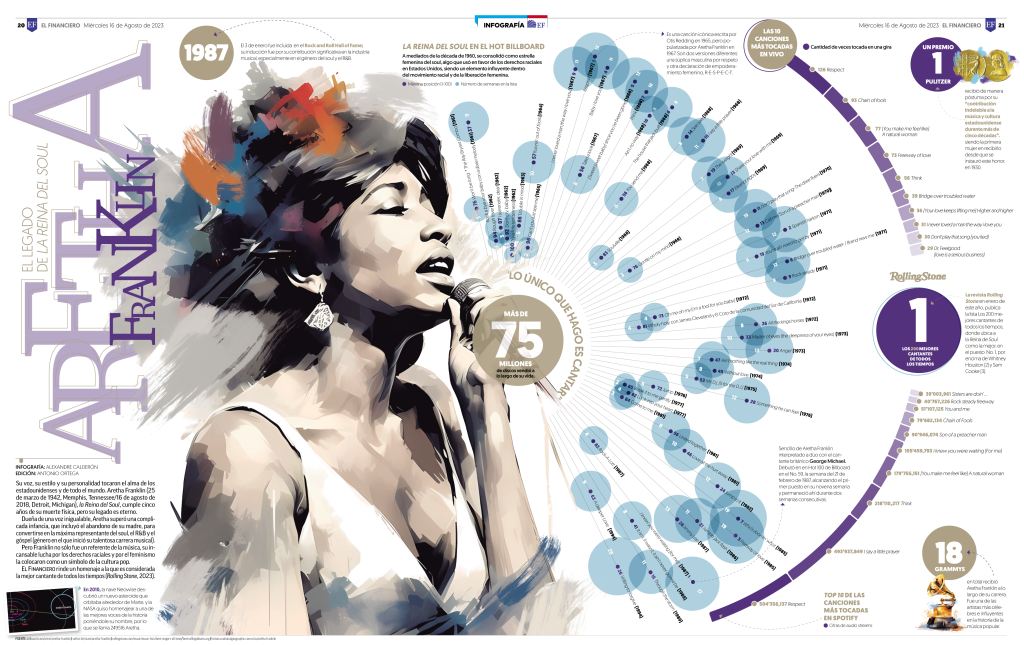
For instance, in an infographic paying tribute to Aretha Franklin, I drew data from Billboard and Rolling Stone, cross-referencing rankings to confirm accuracy before moving to design.
What’s your process for cleaning and preparing data?
I treat data as the foundation of every visual narrative. My process follows three stages: collection, refinement, and structuring. I remove duplicates, correct inconsistencies, and organize the information into tables to reveal patterns.
This is not just a technical step—it’s editorial. I determine which data is truly relevant and how to turn it into a story that the reader can grasp instantly.
Do you begin with sketches, wireframes, or digital tools?
Always with pencil and paper. Sketching helps me organize information and establish hierarchy before moving to digital platforms like Procreate or Illustrator. This combination of analog thinking and digital precision gives me both creative freedom and technical control.

What tools do you rely on most?
- Data preparation: Excel, Numbers, and Word.
- Design: Pencil and paper for the initial sketches, Procreate for early visualization; Illustrator, InDesign, and Photoshop for final development.
- Visualization platforms: PlotDB and Flourish for exploring data-driven approaches.
- Publication: Coordination with prepress to fine-tune layouts for print—and soon, digital formats.
How many iterations do your projects go through before final approval?
Every infographic undergoes multiple stages of review. I first consult with subject experts and editors like Antonio Ortega, whose insights strengthen both content and clarity. The piece then goes to the Graphic Director, Ricardo del Castillo, for visual refinement, and finally to the Editorial Director for approval.
This multilayered review ensures every project meets El Financiero’s standards of rigor and readability.
How do you simplify complex financial or economic data?
Simplification means clarity, not reduction. The key is to translate complexity into meaningful context. Illustration helps bridge understanding, while narrative structure gives data logical flow.
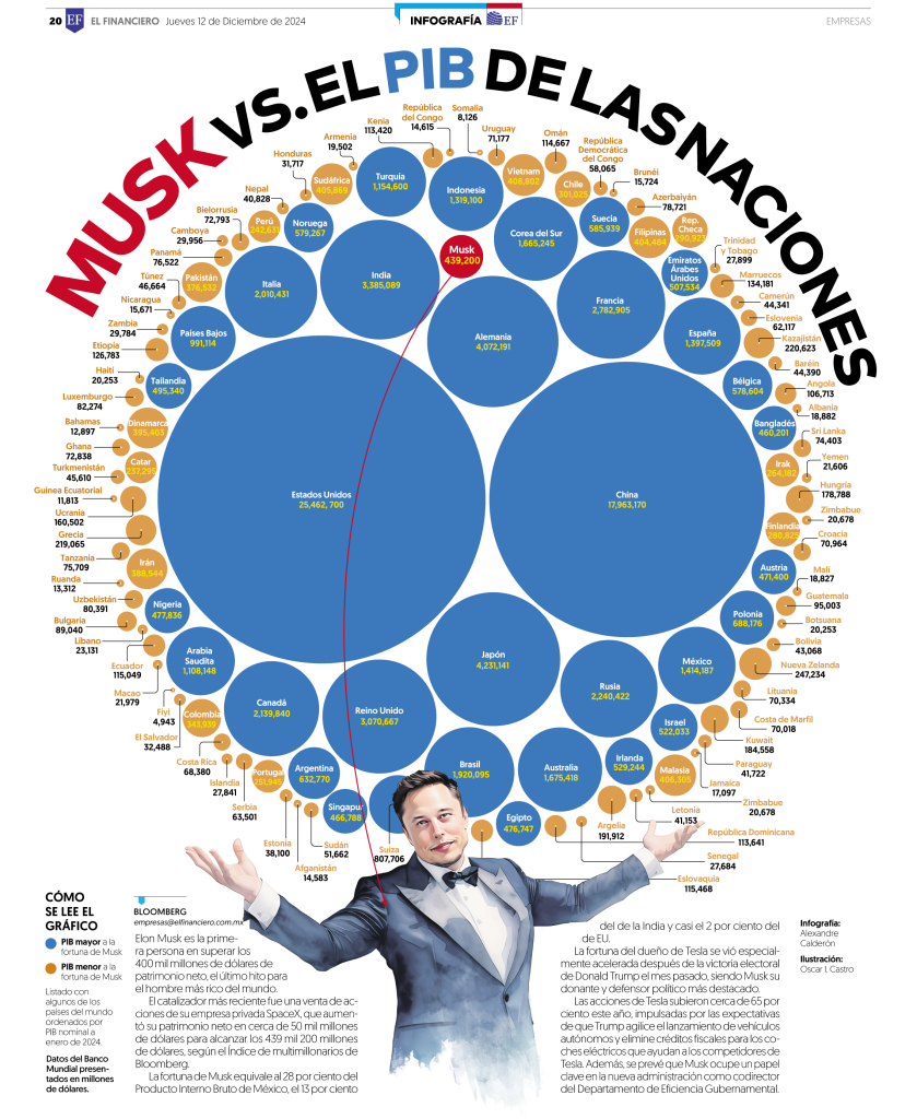
In one piece—Musk vs. Nations’ GDP—I used visual comparison to help readers grasp scale. Seeing Elon Musk’s wealth side by side with national GDPs provided instant comprehension.
How do you balance accuracy with visual appeal?
Accuracy is non-negotiable. But clarity and appeal are also essential. I follow Alberto Cairo’s principle: a visualization must be both truthful and engaging. Every design decision passes one test: Does this element aid understanding, or merely decorate?
If it clarifies, it stays. If it distracts, it goes.
How do you make your graphics accessible to a broad audience?
Accessibility starts with empathy—putting myself in the reader’s place. I prioritize clear hierarchies, legible typography, and balanced contrast. I never assume readers are already familiar with the subject. My goal is simple: clarity without oversimplification, elegance without confusion.
How do you handle sensitive topics or uncertain data?
If data isn’t verified, I don’t use it. Integrity is the foundation of trust. For sensitive subjects, design must be respectful—never sensational. It should guide understanding, not exploit emotion.
How has social media changed infographic design?
Today’s audiences scroll fast and expect instant clarity. Social media demands concise, high-impact visuals—micro-infographics, carousels, short animations—that communicate in seconds.
Designers like Emma Kumer of The Washington Post have shown how speed and depth can coexist beautifully. Social formats haven’t diminished infographics—they’ve expanded their reach and relevance.
Do you see AI as a help or a threat to visual journalism?
I see AI as an ally, not a threat. Used wisely, it can streamline processes and enhance productivity. The danger lies only in letting automation replace human thought. Creativity, intuition, and judgment remain irreplaceable.
AI should assist, not author.
What trends in data visualization excite you most?
I’m inspired by global excellence—the South China Morning Post, National Geographic, and designers like Marco Hernández, Diana Estefanía Rubio, and Federica Fragapane. Their work blends precision, emotion, and narrative power.
These creatives remind me that the best data visualization is both analytical and human.
Which of your infographics are you most proud of, and why?
Every project I’ve worked on has brought me happiness and motivation for the next one. The trust placed in me by the editorial and graphics leadership has allowed me to take full ownership of projects—from idea and analysis to narrative design and execution. Each one holds special meaning for me.
However, two projects stand out as milestones in my career.
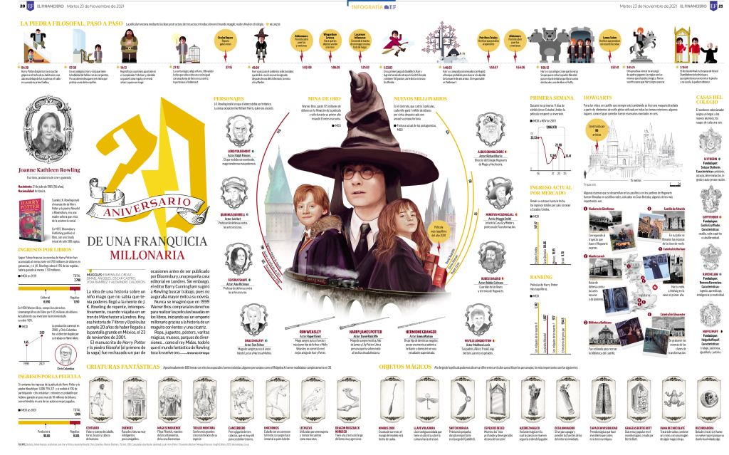
The first was my debut infographic at El Financiero: “35 Years of Thriller: The Video that Changed the History of Music.” Many members of the creative team collaborated on it. I loved working on this project because it taught me how to distill a large volume of information into a clear, structured, and visually engaging layout. We created a graphic showcasing Michael Jackson’s dance moves that invited readers to interact with the design.
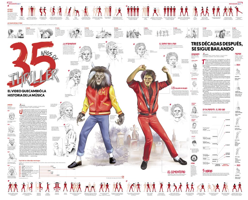
The interactive element consisted of a static micro-graphic embedded within the visual narrative, designed to invite the reader to “step into the scene” and reproduce the choreography, fostering emotional engagement and participation. The project was released in two consecutive installments — the first on day one and the second on the following day— which together formed a complete poster. It was a demanding production that required teamwork, creativity, and precision— but the result was deeply rewarding.
The second project that means a great deal to me was a 12-part series titled “CHECO: Born to Be a Legend,” chronicling the year-by-year Formula 1 career of Mexican driver Sergio Pérez. From idea development to production and printing, it was a project that tested every skill I had.
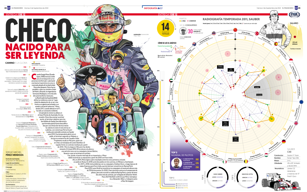
Starting from Pérez’s debut in 2011 through 2022, the series opened with two introductory pages that featured personal details and a career timeline before Formula 1. Each subsequent page presented an “x-ray” of a season—detailing his car, race results, salary, championship standing, points compared to teammates, and other key statistics.
Without question, it was one of the most fulfilling and proudest moments of my career.
What are the three most common production mistakes you see—and how do you fix them?
In my experience, three common mistakes often affect infographic production.
1. Information overload
It’s easy to get carried away by the wealth of raw material and forget that the essence of an infographic is clarity. When we try to include everything, the result is visual noise. The key is to define a clear editorial goal and organize content into coherent narrative blocks. Asking myself “What does the reader need to understand first?” helps shift focus from creator to audience—essential for maintaining clarity and purpose.
2. Lack of data verification
Nothing undermines credibility faster than incorrect or misinterpreted data. An infographic built on flawed numbers loses legitimacy and damages trust. As visual journalists, we carry the responsibility of accuracy. I always verify information with official sources and cross-check it with at least two credible references before moving to the design phase.
3. Weak narrative connection
Sometimes, a graphic looks technically perfect but fails to tell a compelling story. This usually happens when we assume readers know what we know and skip over guiding elements. To avoid this, I start every project with sketches on paper—mapping the story flow from general to specific. Each design element must serve a clear purpose, guiding the reader smoothly through the narrative.
As graphic designers, we play a vital role in storytelling. Beyond aesthetics, design carries ethical and social responsibilities—it shapes how people perceive and interact with information. Responsible design means creating visuals that are accurate, accessible, and honest.
Design also transforms—it educates, informs, and connects people to the world around them. Continuous learning, curiosity, and innovation are essential to this craft. Passion, ethics, and creativity are what turn design from a job into a meaningful contribution to society.
I’m deeply grateful to the entire El Financiero creative team, and especially to my chief and mentor, Ricardo del Castillo, for his trust and guidance in allowing me to create works that have become part of our shared visual history.
![]()