Fadah Jassem, Head of Data Visualization Journalism at The National News, led a powerful visual storytelling project that documents the lives and tragic deaths of journalists killed during the Gaza war. The interactive piece humanizes the toll of the conflict, blending data, profiles, and design to show the dangers faced by media professionals reporting from the front lines.
In connection with this, TK Sajeev, Editorial Director of NewspaperDesign.org, spoke with Fadah Jassem about the editorial vision, data challenges, and design decisions behind this impactful project.
Alongside long-form visual journalism, Fadah launched Data Explained—a signature digital series featuring “Chart of the Week,” in-depth data stories, and animated explainers designed for social media audiences.
When you set out to visualize data about journalists killed in Gaza, how do you determine which data sources are credible and acceptable? What checks and cross-validation steps are involved?
It’s always difficult to independently verify figures from Gaza, especially since Israel has banned foreign journalists from entering the enclave since October 7th. We rely on a combination of authoritative sources, including international agencies such as the UN, WHO, and OCHA; trusted journalist-monitoring bodies like CPJ, IFJ, and RSF; and our own reporters and fixers on the ground. Every record is cross-checked where possible.
We normalise names in Arabic and English, verify dates and locations, and look for consistency across datasets. When discrepancies arise, which they often do we document them transparently. In some cases, we consult OSINT techniques: satellite imagery, verified photos and videos or hospital reports, to corroborate final reporting, which is what we did in our latest investigation on journalist killings in Gaza.
When outliers occur, we ask why, and I think that, as journalists, we are usually good at connecting the causes.
Click to see the interactive graphics
Walk me through the process of turning raw data into a visualization. What are the trade-offs you consider ?
Once we have obtained a data source and we feel confident about using, we first clean and organise the data, often focusing first on names, dates, and geographies. Then we decide on the best structure to tell the story: timeline, map, chart or grid. The trade-off is always detail versus clarity. You want enough depth to be accurate, but not so much that the audience gets lost. This is why speaking with reporters or deciding how granular the story will be is important.
Given the sensitivity of conflict data, how do you handle uncertainties or missing/incomplete data? Do you use estimates, ranges, disclaimers?
In most cases, as it relates to conflict data, we will use disclaimers to make clear it’s limitations. We flag them openly using disclaimers such as “at least” when talking about casualty figures, for example and spelling out the limitations, or ranges of a dataset. If there is incomplete or unclear data we label it as such or label it as ‘unknown’. Transparency is more important than false precision.
How do you choose which types of visualization are most suitable for this kind of story, especially one involving human lives?
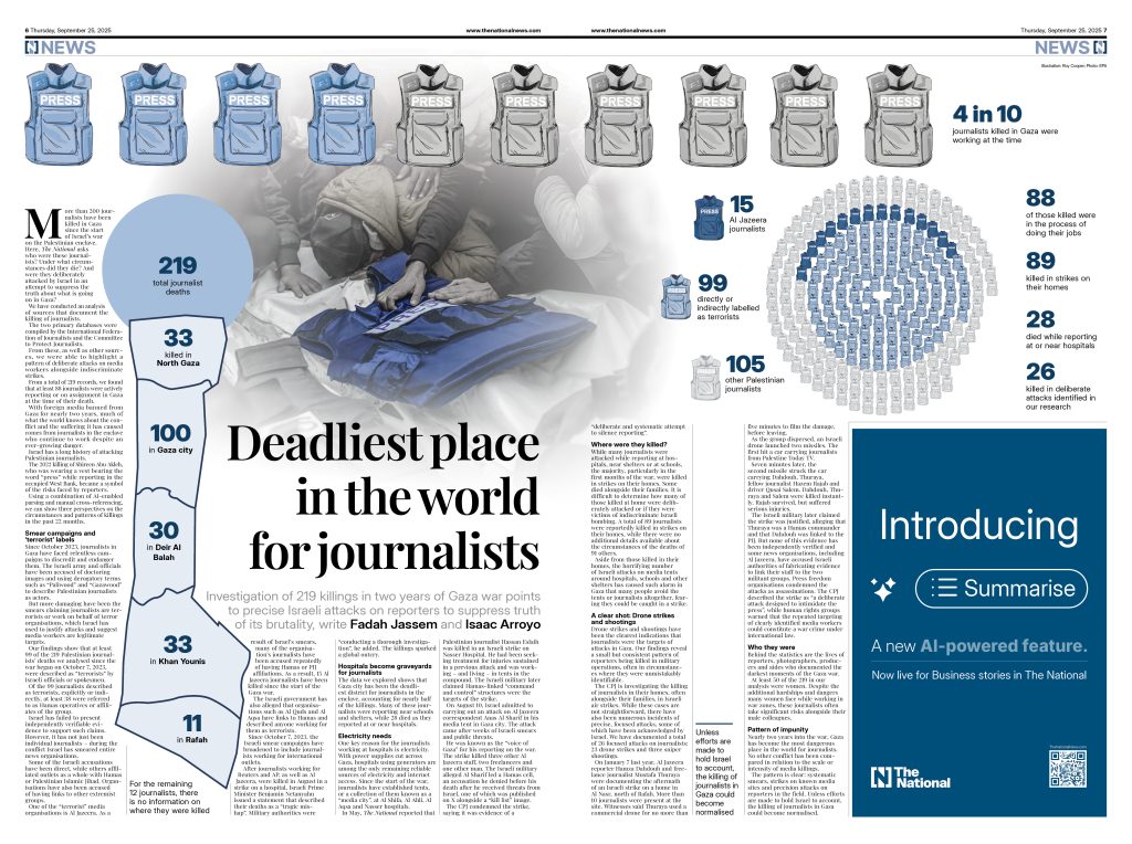
For this particular story, we worked on journalist deaths. we quickly decided to represent each journalist in our data with a press vest. The press vest has multiple meanings, but it also stands out to us as an attempt by the journalists to distinguish themselves from civilians and or militants… the press vest is meant to be a form of protection…. Sadly, in Gaza, this is not the case.
It’s also always nice when you and your colleague have the same sort of visualization in mind which was the case with this story. Both me and my colleague Issac Arroyo thought representing each journalist as a press jacket would work well.
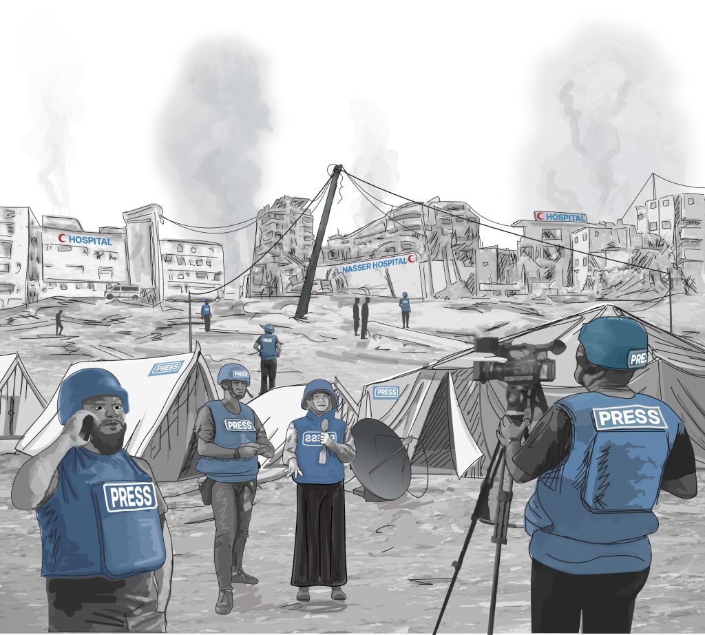
When thinking about a visualization or a chart, I always think what’s the most effective and quickest way to tell the audience what they are looking at, the visualization should be clear or should pull you in to find out more. Adding textual context and quotes is essential here. We spend a considerable amount of time on headings, subheadings, and annotations.
What software tools, platforms or technologies do you rely on for creation and dissemination of these visualizations? How do they limit or enable what you can do?
We use a range or tools and all are dependent on our needs at the time and the type of visualization and platform. For web and shorthand/long-read formats, we will often use a combination of Flourish, Illustrator, InDesign, R, Datawrapper, or Mapbox. For social formats, it can be all of the above, mixed with support from our design team and Adobe Premiere Pro for animations created by our animators. We’ve also been experimenting a little with Canva and Figma.
Illustrations and graphics of killings and deaths often carry a strong emotional weight. What responsibilities do you feel as a visual journalist when representing the stories of those affected?
We feel that weight constantly. Our responsibility is to represent quantitative loss with dignity and precision. Numbers can dehumanise, and our job is to humanise numbers as much as possible.
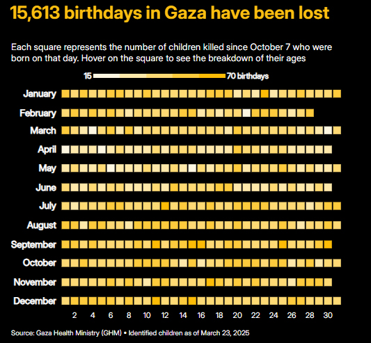
One example was our “Lost Childhoods” piece on Gaza’s child death toll. We didn’t just show how many were killed, but how many birthdays they would never reach, or how many hugs they would never receive (based on psychological research on children’s needs). Some colleagues cried; others questioned whether it was too abstract. Ultimately, we decided to leave it to the audience to decide and the impact of this report was overwhelming positive. That reaction underscored the point:
When the data is unbearable, you need to find ways to make it feel without sensationalising.
Click to see the interactive graphics
Graphic storytelling can sometimes risk being misinterpreted, oversimplified, or even taken out of context. How do you ensure your illustrations communicate the truth without being used as propaganda?
It’s very easy for data or graphics to be taken out of context or even used to push a narrative. People often think data journalism is purely objective, but how you choose to visualize a dataset can really shape how it’s understood. The scale, colour, chart type, or even what you leave out; all of these decisions can change the final intent of a chat and how people interpret the story.
For me, the primary safeguards are transparency and intent. This is also my approach when approaching datasets… is the methodology clear, who are the sources behind this data? I always ask myself what the most honest way is to represent this data without overstating its findings. That means being transparent about sources and avoiding any visual choices that might exaggerate or sensationalise.
Context also matters a lot. Our visuals are never standalone; they sit within strong reporting that explains the data, the methodology, and the limitations, including what the data doesn’t show. And even when they are we, we take a lot of care and time with headings and subheadings of a chart.
In the end, data visuals should clarify, not convince. The goal isn’t to make the data fit a story, but to let the evidence guide the story and to be upfront about where interpretation begins.
What do you hope that visualizations like the ones in that Gaza article achieve? What kind of reaction are you aiming for—from the public, policymakers, other media?
With stories like Gaza, my primary goal is to help people understand what the numbers actually mean. When you’re talking about tens of thousands killed or millions displaced, it’s easy for those figures to lose meaning. Visualization can help bring the scale and the humanity back into focus.
I want our work to cut through figures fatigue and make the data impossible to ignore. Whether it’s showing the loss of children’s lives, the destruction of farmland or the spread of famine, the goal is for people to stop and really see what’s happening.
For policymakers and other media, I hope these visuals act as a form of accountability and a factual, evidence-based record that challenges official narratives and shows the real impact of decisions.
How do you think different audiences – local, international, or those directly affected – interpret these visualizations differently? Do you adapt your design depending on the audience?
I don’t think there’s a huge difference in how we design visuals for different audiences. For us, it’s less about whether the audience is local or international, and more about which platform we’re designing for — web, print, or social. Each platform has its own rhythm, tone, and design language, so we focus on adapting the same story to fit those different spaces.
A good example of this was our print version of the story. After spending considerable time refining the visuals for web and social, our Deputy Head of Creative, Deepak Fernandez, worked on the final print layout. His version was incredibly smart and striking — a reminder of how much impact design decisions can have when tailored thoughtfully to the medium.
Are there new techniques, technologies that you see as promising for improving how conflict risks or journalist safety are visualized ?
Crowdsourced reporting and satellite imagery are good alternatives to inaccessible locations around the world and conflict zones that are hard to reach. They allow us to glimpse the scale and extent of damage or movement really well in the absence of on-the-ground reporting.
How do you foresee the role of visualization evolving in investigative journalism, particularly in contexts of war and human rights?
Visualizations are becoming an essential part of how we document and explain conflicts and human rights abuses. In war, data can be chaotic, incomplete or deliberately distorted so the role of a data journalist is to find ways to capture and communicate the accurate data points more clearly and responsibly.
We’re surrounded by data, from satellite imagery to social media evidence to official reports, and our job is to turn that into something people can actually see and understand. That often requires out-of-the-box thinking, using maps, timelines, satellite overlays or 3D reconstructions to piece together what’s really happening on the ground.
Satellite images show extent of Israeli strikes on Yemeni ports held by Houthis
I think visualization will continue to play a growing role in accountability journalism, not just showing numbers, but providing evidence that can challenge official narratives and help audiences see the human impact behind the data.
Looking ahead, how do you see the role of visualizations and illustrations evolving in conflict reporting, and what innovations or approaches are you most excited about exploring?
Visual storytelling is becoming one of the most powerful ways to help audiences make sense of conflict. In wars, access is often limited and information is tightly controlled. Visual storytelling offers accessibility for audiences in ways that standalone testimonies and eyewitness accounts cannot. Visuals also help segment, and provide snapshots of the evidence. This works especially well for audiences on social media.
What excites me most is how technology is opening up new ways to combine visual evidence, data in storytelling at scale. I’m particularly interested in using satellite data and AI tools to detect patterns of destruction or displacement, and then pairing that with human stories and verified ground reporting. That combination can cut through noise and misinformation in a way that pure text often can’t.
I also think we’ll see more immersive and interactive approaches where readers can explore timelines, see scale, and understand the context of a place. More personalised visual storytelling approaches are also around the corner, and so this is the next horizon im keen to explore.
More about Fadah Jassem
At The National News, Fadah Jassem leads a multidisciplinary team producing impactful data journalism and visual storytelling. With over a decade of experience across leading newsrooms and technology companies, her work bridges journalism, information integrity, and artificial intelligence.
Before joining The National, Fadah held senior roles at Al Jazeera English and Twitter, where she developed AI-driven systems to detect disinformation and strengthen content integrity.
Since joining The National, she has built and scaled the Data Visualization team from the ground up—transforming how the newsroom communicates complex information through clear, evidence-based visuals. Her leadership has made data visualization a central part of the organization’s editorial storytelling.
![]()