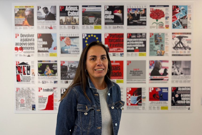
Sónia Matos, Art Director at Público since 2006, shares insights on the newspaper’s design philosophy and Portuguese print culture in a conversation with Editorial Director TK Sajeev for newspaperdesign.org. Under her leadership, Público has earned numerous international design awards.
How would you define Público’s visual storytelling philosophy in today’s fast-changing media landscape?
“Mobile first” is our top priority—and also a major challenge. How do we make stories visually engaging on small screens? What resources work best—video, audio, illustration, photography? How should navigation be designed—horizontal or vertical? Most importantly, how can we ensure a smooth and enjoyable reading experience?
On phones, attention is limited. With so many notifications, readers won’t wait long for a page to load. Even the best design won’t matter if it doesn’t function properly—people will quickly move on.
How do you balance clarity with creativity in your design choices?
Creativity is essential for finding clear, effective solutions. Starting with excellent graphic design and working with a focused, talented team makes the process much smoother.
What role does illustration, photography, and data visualization play in shaping narratives for Público?
They are vital. Público’s audience has always appreciated visual journalism, in both print and digital formats.
Could you share an example where design decisions transformed a complex story into something more accessible for readers?
Three examples:
2.The first fecal microbiota bank in Portugal.
3.Testimonies from people who, 50 years later, accessed documents collected about them by PIDE—the political police of Portugal’s Estado Novo regime—which had invaded their private lives during the dictatorship.
How do you integrate Portuguese cultural identity into the visual storytelling of Público?
Público has always been a global-minded newspaper, shaped by a strong Anglo-Saxon influence, rather than a purely local approach.
Do you believe AI tools can enhance creativity, or do they risk diluting the authenticity of journalistic design?
Currently, AI often produces work that feels generic and lacks personality. Good journalism relies on truth, and its visual presentation should be authentic, original, and distinctive.
What ethical concerns do you see when using AI for visuals—such as deep fakes, synthetic photography, or automated infographics?
AI is a tool, and like any tool, it can be used well or poorly. In journalism, it has enormous potential for mistakes and misuse.
How do you envision a collaboration between designers and AI in the coming years?
Collaboration must be intelligent. Designers need to understand AI’s potential and focus on areas where it adds real value, such as translation, programming, or database management.
Many predict print is fading. Do you see a unique role for Portuguese newspapers in the print format?
Unfortunately in Portugal, reading habits don’t favour the newspaper market, and there has never been a strong tradition of home newspaper subscriptions. Today, with so much information quickly consumed on social media, reading a full newspaper article has become a rare experience.
Despite this, I still believe in the power and legacy of print—especially in a digital world flooded with false information, where AI increases the risk of fabricated content.
I think daily newspapers will gradually shift to weekly or monthly editions, focused on smart, distinctive curation. These editions will cater to curious readers who value the time spent on quality journalism—because it deepens understanding and helps build an informed, democratic society.
How does Público approach print differently compared to digital—are they complementary or competitive?
We maximize the strengths of each format: in print, we combine multiple photos, clear text hierarchy, color, and typography; in digital, we bring stories to life with video, sound, and animations
In an age of instant updates online, what kind of storytelling still works best in print?
The print edition is best suited for the “noble” genres of journalism: investigation, reporting, analysis, opinion, and interviews. These formats give readers more context and depth. In print, strong design also matters—well-structured spreads with clear hierarchy, thoughtful typography, informative infographics, powerful photography, and, of course, illustration.
What lessons has the Portuguese print market taught you about adapting design for survival and relevance?
It taught me that there are limits that cannot be crossed. The readers who buy the printed edition are highly demanding—they pay for a quality product. Just as they are willing to visit several locations to get a copy (since there are fewer sales points in Portugal), they will also stop buying if the newspaper fails to meet their expectations.
Could niche, high-quality print editions become the future rather than mass daily circulation?
Yes, I truly believe in that. I am among those who pay to read high-quality journalism. For me, it’s an investment that makes a difference and adds real value.
How do you nurture innovation among your design team at Público?
I always keep an eye on what’s happening abroad (and locally too). We discuss, share ideas, and invest in training whenever possible. I’m fortunate to work with an extraordinary team who loves learning as much as I do. Working at a newspaper is like being in school—you learn something new every day
Have international design trends influenced Público, or do you feel Portuguese media has its own unique aesthetic?
It definitely had an influence. I believe that many of Portugal’s most important newspapers were, at some point, designed or redesigned by international designers.
If you had to reimagine Público for 2035, what would its design identity look like—in print and digital?
2035 is too far ahead to predict. But I hope that by then, Público will have a strong, distinctive identity—immediately recognizable in both print and digital. Excellent design for excellent journalism. Above all, I hope it will still have a loyal readership.
What first drew you into the world of newspaper and editorial design?
Luck and opportunity played a big role. I started working very early at a regional newspaper, when I was 18 or 19. It was an incredible experience that made me realize that working in newspapers was exactly what I wanted—even before I fully knew it. I was very fortunate. Since then, I’ve never stopped working in newspapers, and every day brings something new to learn. It’s been a constant journey of discovery.
How has your career journey shaped your vision as Art Director at Público?
When I arrived at Público, I had already worked at other newspapers, each with its own character and extraordinary people from whom I learned a great deal. This experience was invaluable, giving me a broader perspective on the field of journalism. Having that open-minded approach was essential to work at Público, a leading reference newspaper in Portugal.
Additionally, working with Mark Porter and Simon Esterson on the first complete redesign of the paper since its founding was a unique opportunity. It allowed me to learn from their extensive experience at top international newspapers like The Guardian and The Sunday Times.
What makes Público unique among Portuguese newspapers in terms of design and editorial approach?
I believe there is great care and attention in how the newspaper is produced—both in the writing of the news and in its presentation. Our readers are highly demanding, and we work hard to meet their expectations.
View the digital version
What has been your most challenging project at Público, and how did you overcome it?
It’s always the next one. We learn from both successes and mistakes, and then focus on the next challenge.
What are your thoughts on the role of typography in shaping the personality of a newspaper?
Typography can play a leading role. In the case of Público, the newspaper’s identity is closely tied to its typeface. Our font, called Publico, is our trademark—used in the logo, in the printed newspaper, and online. It is instantly recognizable.
How important is sustainability and eco-conscious printing in the future of Portuguese print media?
Portugal relies heavily on international paper production. Our market is very small, which makes it harder to access competitive prices and increases production costs.
Overall, I think sustainability is easier to address in print editions—through measures like using recycled paper, publishing less frequently, or planting trees—than in digital production. Digital requires significant energy and resources, including water, which is increasingly precious, especially with the growing use of AI.