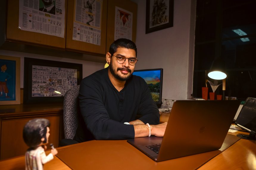
Kannan Sundar, National Design Editor of The Hindu, one of India’s leading newspapers, discusses how it shapes reader experience through visual storytelling in a conversation with TK Sajeev , Editorial Director of newspaperdesign.org
What is The Hindu’s guiding philosophy in shaping reader experience through design and storytelling?
The Hindu’s guiding philosophy in shaping reader experience is to combine clarity, credibility, and context. We don’t see design as decoration, but as an essential part of how journalism is received and understood. A well-designed story helps readers engage with complexity without feeling lost or overwhelmed. Our focus is always on making sure that the presentation respects the seriousness of the story while making it accessible to different kinds of readers.
How do you balance editorial integrity with visual appeal in a newspaper known for its credibility and gravitas?
At The Hindu, credibility comes first. Our readers trust us because of the paper’s history of gravitas and editorial independence, and design must never compromise that. At the same time, visual appeal matters because it is what draws the reader in. I believe design should amplify editorial integrity, not overshadow it. For example, using bold colours or dramatic imagery might attract attention in the short term, but if it distorts meaning, it erodes trust. The balance comes from ensuring that every visual choice serves the story’s truth.
What role does design play in The Hindu’s identity compared to other Indian dailies?
Compared to other Indian dailies, The Hindu has always stood apart as a paper of record — serious, analytical, and measured. The design reflects this personality. Where some newspapers might rely heavily on loud visuals or sensational layouts, The Hindu’s design is about restraint, elegance, and function. We consciously maintain a clean aesthetic and typographic discipline, while still pushing visual storytelling to make complex data, cultural issues, and international stories more understandable.
How do you decide when a story needs a visual-led approach—with graphics, photos, or infographics—versus a traditional text format?
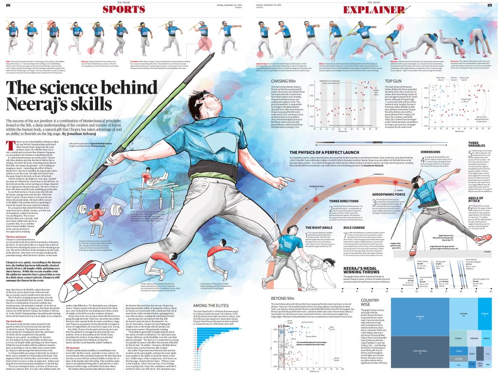
We decide to go visual when a story has a level of complexity, scale, or human impact that words alone may not convey effectively. Environmental data, humanitarian crises, election results, or stories involving large datasets often demand visuals. For instance, during the Kallakurichi hooch tragedy (interactive graphics), a visual-led approach allowed us to combine text, illustration and interactive elements that made the scale of the disaster more comprehensible. If a chart, map, or illustration can explain in 10 seconds what text might take 500 words to describe, we choose the visual route.
Can you share an example where design significantly enhanced reader engagement with a complex news story?
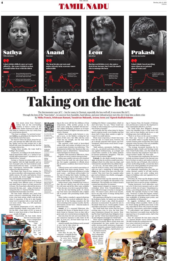
The Heat Stress in Chennai interactive is a strong example. The story could have remained a technical report on temperature and humidity, but through design, we turned it into a human story: how heat affects working-class bodies in the city. The interactive structure, illustrations, and colour coding helped readers relate data to their lived experience. The engagement was far higher than text alone could achieve, and it showed how design can bridge science and storytelling.
Go to the interactive graphics
What are the key elements you and your team prioritize to make visual storytelling both aesthetic and functional?
For me and my team, three things are non-negotiable: clarity, narrative flow, and accessibility. Clarity means simplifying data without distorting it. Narrative flow means designing the story so that each section builds on the previous one, guiding the reader like chapters in a book. Accessibility is crucial — our designs must work on mobile first, be mindful of colour blindness, and stay culturally sensitive. Aesthetic value is important, but it always has to serve these three pillars.
In what ways do readers’ habits and expectations shape your design decisions?
Our readers today have multiple habits. Some want to sit with a long-form narrative, while others want to scan headlines in a few seconds. Design has to serve both. We use pull quotes, infographics, and summaries for quick consumption, but we also design layouts that allow for depth and extended reading. In digital, this means layering content so that a casual reader gets the essentials quickly, while a curious reader can dive deeper.
How do you design for different audience segments—from long-form readers to those scanning headlines quickly?
We create layered experiences. For the scanner, we ensure the top takeaway is clear. For the detail-seeker, we embed charts, sidebars, or expandable graphics. And for the long-form reader, we design an immersive flow that rewards their patience. Each audience finds its own level of engagement without feeling excluded.
Do you gather reader feedback on design, and how does it influence your work?
Feedback comes in different ways. Analytics tell us where readers spend time, drop off, or share stories. Direct comments tell us if something feels confusing or too dense. Internally, editors often bring in feedback from the field. Sometimes, small changes — like adjusting font size for better legibility on mobile, or tweaking chart labelling — come directly from such feedback. Over time, this loop has helped us make design decisions that are reader-first, not just newsroom-driven.
How is The Hindu adapting visual storytelling for digital and mobile platforms while retaining its print legacy?
The Hindu is adapting with a mobile-first mindset while retaining its print DNA. For digital stories like Gaza or Kallakurichi, we design for scrolling, responsiveness, and visual pacing. But we also ensure that these projects translate back into print as full-page features. That continuity between print and digital is part of our identity — it allows us to be modern without abandoning our legacy.
What new tools, technologies, or storytelling formats are you experimenting with?
We are experimenting with Figma, scroll-driven storytelling, D3.js data visualisations, and parallax effects for depth. We also use lightweight motion graphics and SVG animations to enhance storytelling. These tools allow us to move beyond static infographics into interactive experiences — but always with the constraint of speed, bandwidth, and accessibility in mind.
How do you see AI and automation influencing the role of design editors in the near future?
AI is beginning to reshape workflows, but I see it as an assistant, not a replacement. For example, AI can resize, crop, or suggest chart styles automatically. It can also help clean or parse datasets quickly. But the human role is to apply editorial judgment: knowing when a chart is misleading, when colours imply bias, or when simplicity is more powerful than complexity. Design editors will remain the gatekeepers of nuance and responsibility.
What are the biggest challenges in leading a national design team for a legacy newspaper?
The biggest challenge is balancing creativity with consistency across multiple editions and platforms. Another challenge is resources — for example, we often need dedicated developers within the design team to execute ambitious ideas. But the cultural challenge is even bigger: helping colleagues in traditional news structures understand that design is not cosmetic, but core to storytelling.
How do you nurture creativity and consistency across multiple editions and platforms?
We use style guides and visual frameworks to maintain consistency, but we encourage experimentation within those boundaries. Weekly design reviews and open discussions allow the team to test ideas and learn from each other. I believe creativity thrives in a system that has enough structure to avoid chaos, but enough freedom to avoid rigidity.
The Hindu has a reputation beyond India. How do you ensure its design and visual storytelling meet global benchmarks of quality?
We constantly measure ourselves against global leaders — NYT, Reuters, The Guardian. Projects like our Gaza interactive or the Heat Stress in Chennai story show that Indian newsrooms can match global standards in clarity, innovation, and reader engagement.
Over the years, our design team has won 11 international awards, including recognitions from the Society for News Design (SND), WAN-IFRA Digital Media Awards, and the NewspaperDesign.org. These recognitions are important, but our ultimate benchmark is always the reader — making sure the design elevates the story and builds trust.
Do you look to international newspapers or design trends for inspiration, or do you prefer to develop a distinctly Indian visual language?
We draw inspiration from international design but adapt it for Indian contexts. This means multilingual layouts, culturally resonant colour palettes, and narrative styles that make sense to our audience. Our goal is to be globally comprehensible but locally meaningful.
How do you adapt universal principles of design—like clarity, hierarchy, and storytelling—to an Indian cultural and linguistic context?
Universal principles like clarity, hierarchy, and storytelling are the foundation of good design, but in India they need to be translated into a multicultural and resource-diverse environment. For example, clarity is not just about typography or whitespace — it’s also about ensuring a story works for readers who may encounter it in print, on desktop, or on mobile devices. Hierarchy has to account for how Indian readers scan pages — many look for numbers, quotes, or visuals before diving into text. Storytelling must be sensitive to cultural nuance: colour choices, symbols, and imagery that carry one meaning in the West may be interpreted very differently here.
So, while we follow global best practices, we adapt them with local empathy. A good example is election coverage — we use colours and iconography that are culturally familiar, maps that reflect regional boundaries readers recognise, and layouts that can compress large amounts of information without overwhelming first-time voters or casual readers. This blend of universal design values with Indian context is what keeps The Hindu’s design both globally benchmarked and locally resonant.
When covering international stories, how does your team approach visuals to ensure they resonate with readers across cultures?
For international stories, we keep visuals universal — clear charts, human-centric imagery, minimal jargon. But we also add explanatory notes or cultural context so that our readers in India can relate to events unfolding far away. In Gaza, for example, we used charts to show humanitarian impact in a way that transcends political boundaries.
Go to the interactive graphics
What lessons can international design editors learn from The Hindu’s approach to balancing tradition with innovation?
I think The Hindu offers a lesson in balance: how to respect tradition while still innovating. We protect editorial seriousness, but we are not afraid to experiment with interactives, data stories, or digital-first design. That balance is valuable in a media environment where attention spans are shrinking but credibility is more important than ever.
How do you see The Hindu’s visual storytelling evolving to remain globally competitive in the next five years?
I see The Hindu’s visual storytelling becoming more immersive, interactive, and multimedia-driven. We will experiment with hybrid formats that bridge print and digital, and we will use AI to speed up processes without losing human editorial control. The goal is to keep readers engaged while staying true to The Hindu’s reputation for gravitas.
As design becomes increasingly central to journalism worldwide, what role can Indian editors like yourself play in shaping the global discourse on visual journalism?
Indian design editors bring something unique to the global conversation: we design for multilingual, resource-constrained, mobile-first audiences. Our solutions are creative, frugal, and deeply human. As journalism becomes more global, these lessons — of clarity under constraint, of storytelling for diversity — can shape the way design is practiced worldwide.
![]()